We recently used KissMetrics to measure the performance of our upcoming homepage test, which I wrote about on the KissMetrics blog. In that post, I mentioned my method of working backwards from your desired results to determine which reports to run. Once you know the latter, you can work out a required list of events and properties, including where they should be implemented. The goal of this post is to teach you how the process works—enough so that you can replicate it in your own testing methodology. I need to give credit upfront to our VP of Marketing and Sales, Ryan Butters, who taught me this approach.
Define what success looks like
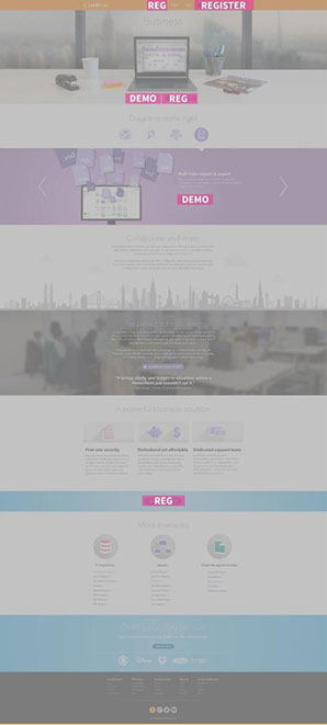
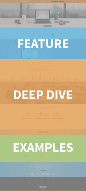
Below you’ll see the proposed layout for the new homepage and three persona-specific tour pages. I show the layout three times to highlight the different factors we’re interested in measuring. This first view highlights the locations where visitors can register or demo our product.
Below I am interested in where on the page the activity is happening: menu, hero shot, or below the fold.
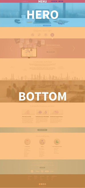
Finally we want to gauge the effectiveness of the UX elements below the fold in engaging users. We will measure whether these elements result in incremental registrations.
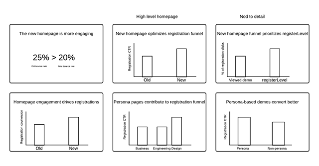
After sketching out key results that would demonstrate a winning homepage test, I ran them by management to make sure we were all on the same page. We had spent a full quarter working on this redesign, and I didn’t want to waste time measuring the wrong results. An advantage of this approach is that it adheres to the number one rule of executive communication: avoid surprises at all costs. Show them up front what you consider success to look like, before you even start detailed planning. They’ll let you know whether your priorities are in sync.
Start at success and work backwards
Once the six slides (above) were approved, the next step was figuring out which reports I would use. Let’s go through this slide by slide to see how I pitched the importance of each result, along with the kind of reporting I required. Take note of the different variables needed to run the report because we’ll discuss that afterwards.
Desired result:
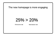
This first slide demonstrates that the new design is more engaging than the old design. We planned to pull the bounce rate from the old homepage and the new homepage and show that the bounce rate for the new design is lower than the current design.
Reporting methodology:
We can pull the bounce rate of these two pages from Google Analytics.
Desired result:
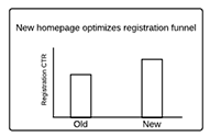
The second slide demonstrates that the new homepage is more effective at driving the primary goal of the page. We want more people to go to the registration page. Beyond a more engaging design, we’ll also give the visitor more opportunities on the page to get to the registration page.
Reporting methodology:
We need to aggregate different registration buttons across the homepage into one rollup statistic. This means creating a single event for registration clicks. I’m going to use a KissMetrics funnel report for this one. By creating a single event that will be tracked on both versions of the homepage for all registration buttons, I can easily roll up the registration CTR by—and sort on— different versions of the test. One thing I will note is that when setting up a test, it’s advisable to take advantage of KissMetrics’ ability to set up tracking on different stages of development. This enables testing of event collection and reporting approaches on our staging environment before the test is ever deployed, as shown below. 
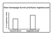
Desired result:
We know that visitors who go directly to the registration page are more likely to register than people who enter the demo first. This might be due to self-selection, but we would like the new design to be weakly dominant (at least as good) in its ability to emphasize registering now over trying out the product.
Reporting methodology:
In order to collect the data needed to demonstrate that the new page is driving more traffic through the registration page (versus the demo page), we must aggregate all homepage registration clicks and compare those to demo clicks. So I created an event for demo clicks, as seen below.  Speaking of rolling up statistics, I was so happy the day I learned about the ability to set KM events as class attributes. You may have noticed that I used “.PT2democlick” instead of “PT2democlick”. I felt annoyed that I was being forced to use an ID attribute on every demo button when a class attribute is more appropriate. Luckily, I have been trained to never request a new feature without doing my homework in the product. Below you can see a class attribute and an id attribute on the same button.

So now that I have the ability to compare demo clicks on the page to registration clicks on the page, I’ll generate a power report. A power report is perfect for showing multiple statistics side-by-side that aren’t part of the same funnel.

Desired result:
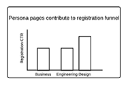
We expanded on the persona approach of our existing homepage by providing a separate tour page for the three main personas that we identified (in addition to our general tour page). We are treating these pages as cleanup hitters, and designed the homepage so that the persona tour pages don’t cannibalize registrations. If that did happen, we would see that in slide 2 . Since these are new pages, we’re only setting a benchmark. One thing I have noted to myself is that I expect that the CTR rates for the persona pages to be higher that the home page, since visitors are better qualified by opting into the persona page experience.
Reporting methodology:
I could fire an event for each of the different page visits or I could set a property value based on the current page that they are on. I opted to do both because the cost of implementing a little more tracking upfront is much cheaper than having to restart testing if I wasn’t able to completely answer follow-up questions based on the final results. I can also add the demo and registration events into the class attributes for these three pages. Then we’re done!

Desired result:
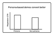
Our final slide is a nod to the fact that our redesign includes a improved demo experience. For example, if you are on the Product Management and Design persona design page, the demo takes you into a wireframe document that is highlighted on the page. We believe that this will be a better experience than sending visitors to a blank canvas.
Reporting methodology:
Measuring the impact of two different demo experiences means comparing the registration rates of visitors that experience the newly designed demo to the registration rate of visitors that experience a demo with a blank canvas. I will run a funnel report looking at the flow: Visited site > PT2 demo click > registration by test version and filtering on just the B version to get the registration rate on the new demo experience. Since we track demo view as an event, I can look at the flow: Visited site > Viewed demo doc > registration for the whole site and filter out anyone that saw the B version of the test. This approach gets me all the registration data for the old demo experience, not just demos from the A version of the homepage.
Going the extra mile
I put a lot of thought into executive-proofing these test results. This can be useful in two different areas. First, those slides I built have helped me prepare for follow-up questions. Make sure you have the data to answer reasonable inquiries, but also be prepared to say in some cases: “Let me get a chance to look into that and I will get back to you.” As odd as it sounds, it can be impressive that you know right away which questions you won’t be able to answer based on the data you collected. Second, you won’t always get the clear-cut results that you were hoping for when you created your slides. If the test wasn’t an unqualified success, you have to be ready to parse the testing data to show which parts went well. For my tests, I also considered the needs of our UX team. They spend a lot of time designing to requirements presented by the marketing team, so they want to know which parts of the design work well and which elements should be reworked. Some of the higher-production items are of particular interest. They want to know how many people are actually using the feature slider or clicking on a demo button next to an animated gif.
A few words more
Instead of writing out all the events and properties, I’m including an implementation guide that I created for our front-end developers. You will also see a note on the roles of each event when it comes to reporting goals. I hope this post was helpful, and I wish you luck with your next big test! Let me know how your A/B tests have led to more compelling and useful results.


 Speaking of rolling up statistics, I was so happy the day I learned about the ability to set KM events as class attributes. You may have noticed that I used “.PT2democlick” instead of “PT2democlick”. I felt annoyed that I was being forced to use an ID attribute on every demo button when a class attribute is more appropriate. Luckily, I have been trained to never request a new feature without doing my homework in the product. Below you can see a class attribute and an id attribute on the same button.
