
Introduction
Picture this: You have a grand vision for your project, a story you're itching to tell, or a plan that's brewing in your mind. However, the parts of your plan are scattered across different tools; data living in spreadsheets and diagrams in Lucidchart. How can you bring all these elements together to create an easy to understand visualization? The answer lies in turning data into simple visualizations that are easy to understand, but still pack a punch! Whether you're a seasoned pro or just starting your journey into the world of diagrams and charts, there's something truly enchanting about the way Lucid can convey data through visuals. Today, we're here to demystify a concept that might sound technical at first, but fear not—it's a superpower that empowers everyone, regardless of their technical background. Our adventure today will take us through the entire process of visualizing data; from what data we should visualize to what visualizations will wow your viewer.
Before we jump into how to visualize your data, let's jump into why we should visualize data. We've all heard that a picture is worth a thousand words, but is that actually true? The University of California, San Diego didn't quite quantify how many words an image is worth, but they found that even if a picture was shown for 10 milliseconds, it had an impact on human behavior. Whether a picture is worth a thousand words is up for debate, but it's clear that people can be greatly impacted by a picture. So let's talk about how you can get that impact out of your Lucidchart diagrams!
Bringing data into Lucid
The first step in visualizing data is understanding what data we want/need to visualize. Most diagrams made in Lucidchart have some sort of data about them hidden inside of a spreadsheet. Whether it's NPS scores for a customer journey, lead time in a value stream map, or scrum teams for your engineering org, Lucid can help you import and visualize data. Inside of Lucidchart click on 'Import Data ' which is found in the bottom left corner below "More Shapes". In the next pop-up window, select the first option,"Data linking and conditional formatting”. Follow the prompts to import your data. Now you should see your data on the left-hand panel in Lucid!
Pro Tip: Check out what other diagrams you can generate using data in the "Import Data'' tab! Org charts are a great example of a diagram that can be automatically generated with data!
Attaching data to your diagram
Congrats on getting your data into Lucid! Let's get working on attaching that data to the shapes in your diagram. All you have to do is grab a row from your spreadsheet and drag and drop it onto a shape. That shape data can then be viewed by opening the contextual panel on the right-hand side. The row of data has become key-value pairs on the shape. Now we can focus on visualizing that data. 
Pro Tip: You can create custom shapes to house the data from your spreadsheet. Check out the gif and this link to learn more!
Visualizing your data
We've already got your data connected, so now it’s time to work some magic! Click on the magic wand icon found on the customization bar in Lucidchart. This will open up the conditional formatting tab. Here is where we will be able to visualize the data that we have attached to our shapes. Conditional formatting rules allow you to use conditional statements like greater than, contains, or equal to compare the data on your shapes to a value of your choice. This is how we will help our viewer go from trudging through bogs of data, to blissfully walking through a field of visualizations. In the example below, we will explore how we can visualize NPS scores.
Let's take a quick look at these rules that were created!
First, check out the top portion—the first “if” Statement. “If-then” statements are the skeleton of conditional formatting rules; without them nothing else could stand. A great example of “if-then” statements is the rolling of a dice. In many games, you roll the dice, and a specific action takes place based on the number you roll. If you roll a 3, then you fail your attack. Similarly in Lucidchart, we will craft conditional formatting rules that will check if our data values meet a specific condition, then add an icon to that shape.
The first box tells us that we are looking at Shape Data. You can change this field to things like text, shape type, etc.
The second dropdown is which specific data field we'd like to use. These are the column headers that we have in our spreadsheet.
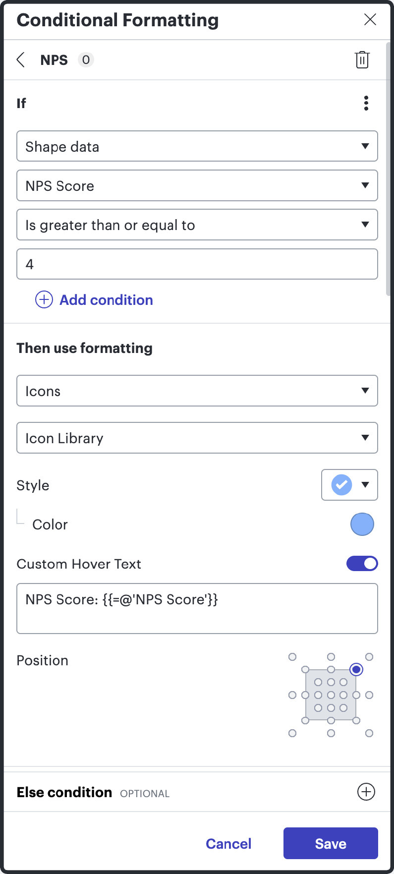


The third box is where we place our conditional statement. Examples are contains, equal to, or less than or equal to.
The fourth box is where we put our comparative value. In our example, an NPS score is considered acceptable if it is greater than or equal to 4.
Once we make our first “if” statement we can add “else-if” and “else” statements. These will work exactly like our first “if” statement, but they will only occur if our first “if” statements condition is met. Back to our dice rolling example, if you roll a 3, then you fail your attack. Else, if you roll a 5, succeed in your attack. So if you rolled a 5, the first “if” condition wouldn’t have been met, but the second would have! Here are the other two “else-if” statements for you to take a look at.
Pro Tip: You can use more complex formulas in conditional formatting. You can learn more by taking the course found here.
Notice that when you look at this diagram now, you don't need to understand what an NPS score is or even what numbers are associated with the icons on each shape. It's just like we talked about above. The icons allow you to understand where we are succeeding, where we have some need for improvement, and finally, where we have serious problems.
What could’ve taken several minutes to understand is now easily understood in a matter of seconds.

Telling your story
Each diagram in Lucidchart tells a story. When we use conditional formatting in Lucidchart, we transform these visual elements into narrators that guide the viewer's attention to the most critical aspects of the data. This storytelling technique allows us to emphasize the highs and lows, pinpoint trends, and highlight outliers, making it immediately clear what the key messages are. By setting up conditional rules, each element in your diagram reacts to the underlying data, changing colors, shapes, or icons depending on the conditions met. This dynamic interaction not only makes your charts more engaging but also helps to ensure that your audience can understand complex information at a glance. As you tailor these visuals to tell your story, you empower viewers to grasp not just the facts, but also the impact and insights your data holds.
In conclusion, mastering conditional formatting in Lucidchart is about much more than just adding visual flair to your diagrams, it's about effectively communicating your data-driven insights in a way that is intuitive and immediately actionable. By leveraging these tools, you transform static images into compelling stories that resonate with your audience. Remember, the power of a well-crafted diagram lies in its ability to simplify complexity and evoke a deeper understanding. So, as you venture forth, use these visualization strategies to not only showcase your data but to inspire, inform, and influence your viewers. Happy charting!