Great designers balance clarity, aesthetics, and functionality to build compelling visuals. For the non-designers, though, achieving this can be challenging. You may feel like your documentation isn’t professional or visually appealing enough to share. The good news is that you don’t have to be a designer or have a creative streak to design something that captures your audience.
By harnessing the principles of visual psychology and design, you can create diagrams that capture attention and enhance understanding.
In this blog post, we will identify the challenges of designing impactful documentation and provide seven tips for non-designers on how to leverage visual communication with clarity and intention.
Why is good design important in visual communication?
Every day, we are bombarded with thousands of designs—from the traffic signs directing us on the road to the menus enticing our tastebuds. These examples of visual communication are all around us, each designed with a specific purpose. A traffic sign is designed to quickly alert you with bright colors and bold writing. A well-designed menu is easy on the eyes, organized from appetizers to dessert, and matches the restaurant's aesthetic.
Effective design does what it’s supposed to: alert, stop, invite, teach, and so on.
When design is bad, though, it can lead to misunderstanding and confusion. While a poorly designed coffee maker manual may be a minor frustration (depending on who you ask), a badly designed stop sign can be fatal.
“[Design] shapes what we understand, what we remember, and how we really engage and experience things.” —Amy Simek, Enablement Manager, Lucid

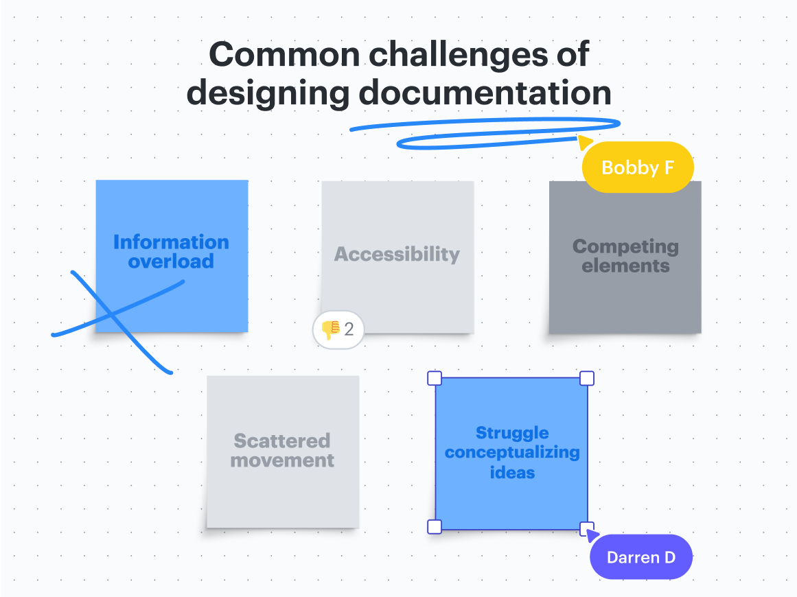
Common challenges of designing documentation
Just as we have seen good design, we’ve all seen bad design too. Here are some of the challenges of designing documentation.
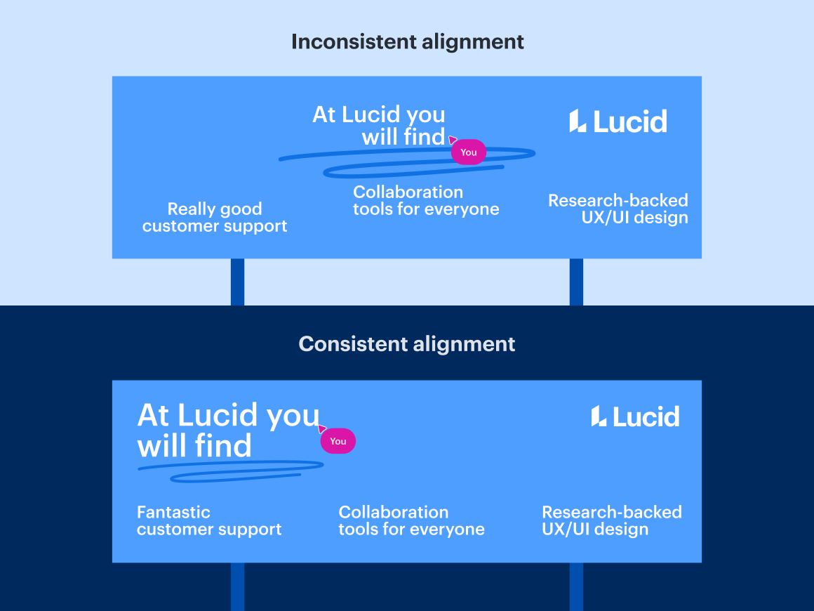
Information overload
Cramming too much information into one design can overwhelm your audience. Remember that not everyone needs to know everything about a process. For complex processes, try to choose the most critical steps, and utilize icons and images rather than clunky text.
Accessibility
Visuals and documentation without contrast can be hard on the eyes. Imagine a red stop sign with orange lettering; the word “STOP” would be hard for people to read! Understanding and applying color theory will help you use colors that complement each other rather than compete for attention, making your design available to the broadest possible audience.

Competing elements
Too many competing elements in a document can distract your audience and make it challenging to understand. Inconsistencies like clashing colors and uneven shapes draw attention away from the main idea, weakening the overall impact of your visual.
Scattered movement
When creating visuals like processes and flowcharts, the direction of how these visuals flow is important. But with such limited space, this can be difficult to do.
Conceptualizing ideas
It can be challenging to break down complex processes and ideas into clear visuals. Communicating visually is about simplicity without losing important details needed for viewers to understand.
Tips to improve your visual communication
Function and flair are the overarching elements of good design. Here are some of our top tips and examples for weaving the two together to help you communicate visually with your audience.
Function
Contrast
A little bit of contrast goes a long way in a visual document. It creates emphasis and interest and guides the viewer through design rather than having them figure it out independently.
Tip #1: Make the contrast bold. Notice how the image text to the right stands out more than the one on the left.

Repetition
Consistency and repetition in your designs will help the audience retain information better. By intentionally reusing elements such as color palettes, fonts, and shapes, you establish unity and clarity, making your visuals easier to understand.
Tip #2: Remember that too much repetition can make the design boring, so don’t be afraid to play around with different elements so long as there are common threads throughout the design.

Alignment
Proper alignment in visual communication directs the flow of your design. It also establishes structure and harmony, creating connections between elements.
Tip #3: Avoid using multiple types of alignment in your design for consistency.
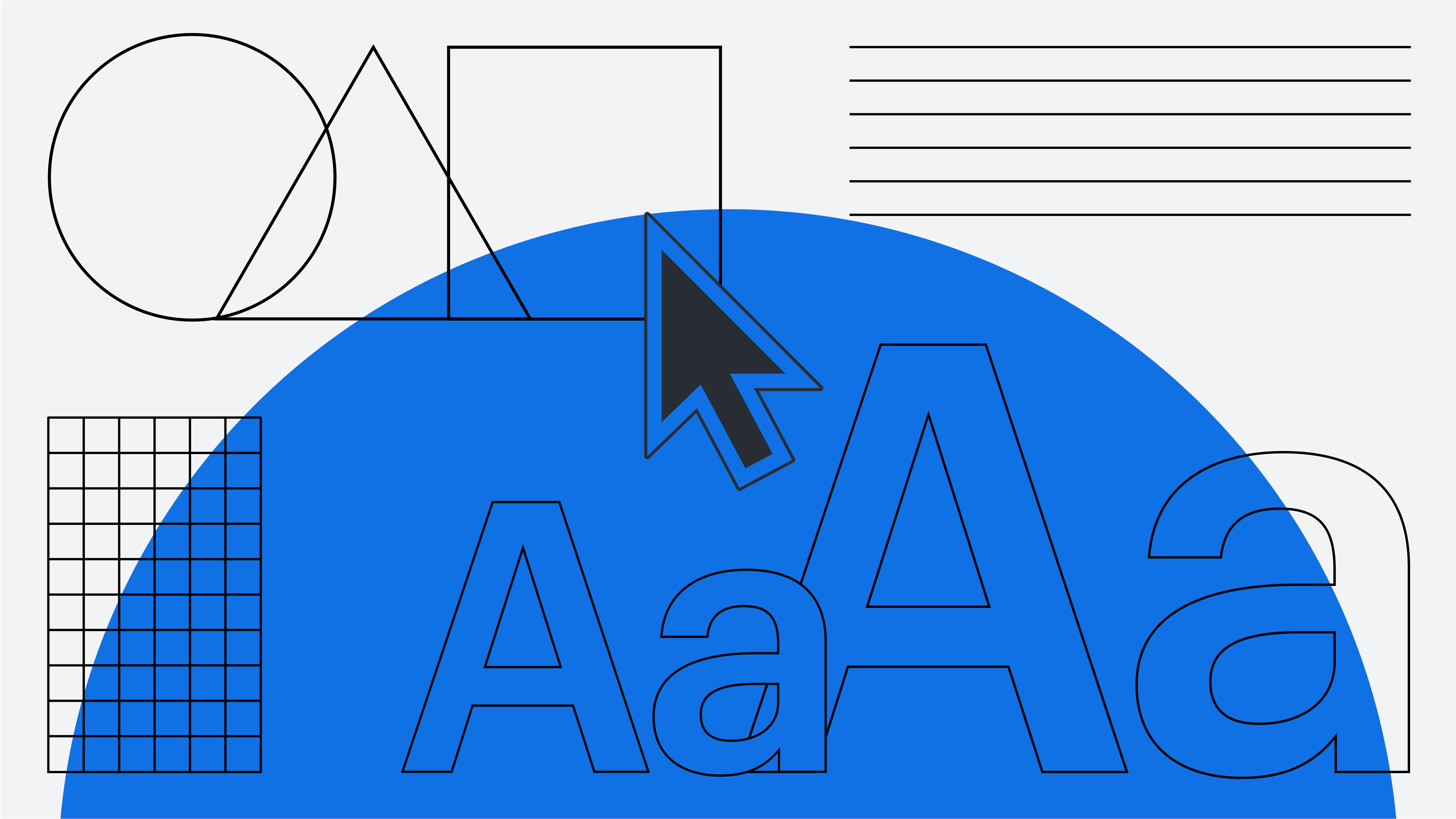
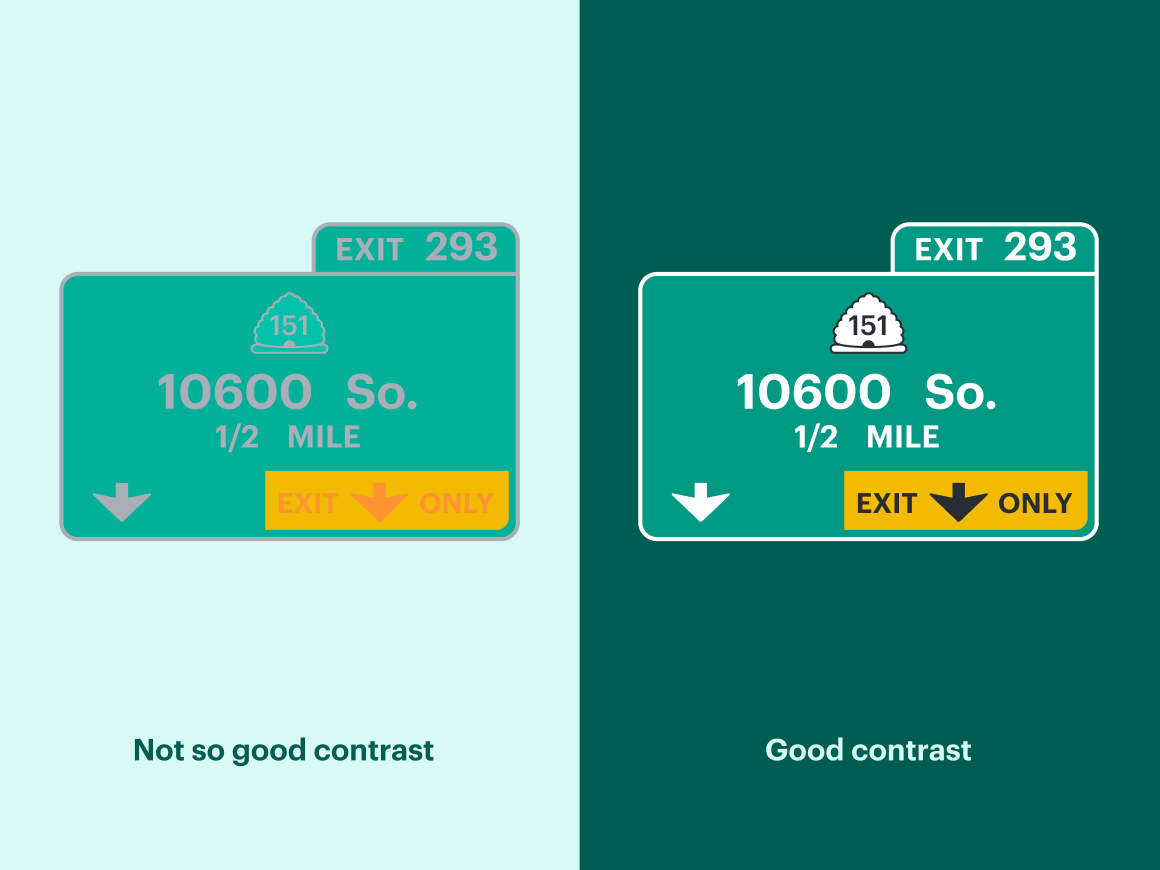
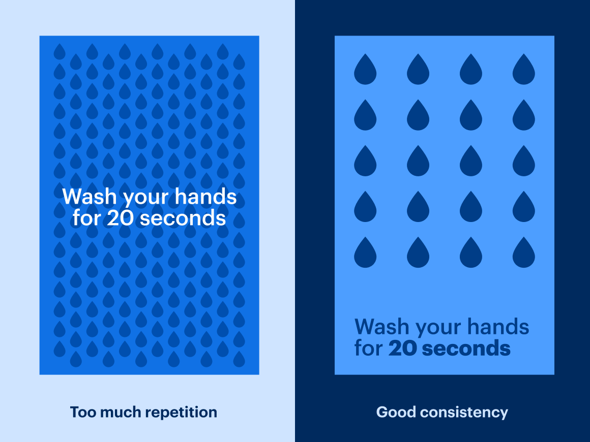
Proximity
Strategically grouping related items in your visuals helps establish clear connections for your audience. For example, if you illustrate your company’s onboarding process, you might divide the information by day so that the viewer sees everything they need to do in one frame.
Tip #4: Avoid cramming too many separate elements together. Make sure you group items that are relevant to each other.

Layout and refinement
Once you’ve gathered all the information needed to build your visual, you've reached the layout stage. As you mock up your design, keep in mind repetition, alignment, and proximity.
After you’ve laid your content out, it’s time for refinement. Play around with different elements and consider creating multiple iterations to compare. Simplify your design to increase comprehension by removing extra noise, embracing the white (blank) space, matching the size of similar objects, and leveraging repetition for consistency.
The overall goal of visual communication is to reduce friction and deliver ideas clearly.
Tip #5: Emphasize objects on your board by using one to two fonts, using contrasting colors, and making the call to action clear. What do you want your audience to do with the information?
Flair
Color
Avoid black-and-white visuals—add color to emphasize, excite, and increase comprehension. In general, try to use three colors or fewer to avoid busyness, and make sure you use colors that are highly visible and easy to read. Aim for a balance between colors and saturation.
Tip #6: The 60-30-10 rule will help you balance color. Use the dominant color for 60% of the design, the secondary color for 30%, and the accent color for 10%.

Images and Icons
Integrate images and icons thoughtfully to enhance your design. Every element should serve a purpose rather than be a decoration.
Tip #7: Use the same icon set throughout your design to promote unity.

Now that you know the basic elements of good design, put your visual communication skills into practice with our self-paced course.
Register nowAbout Lucid
Lucid Software is a pioneer and leader in visual collaboration dedicated to helping teams build the future. With its products—Lucidchart, Lucidspark, and Lucidscale—teams are supported from ideation to execution and are empowered to align around a shared vision, clarify complexity, and collaborate visually, no matter where they are. Lucid is proud to serve top businesses around the world, including customers such as Google, GE, and NBC Universal, and 99% of the Fortune 500. Lucid partners with industry leaders, including Google, Atlassian, and Microsoft. Since its founding, Lucid has received numerous awards for its products, business, and workplace culture. For more information, visit lucid.co.
Related articles
4 types of communication styles you're working with [+ flowchart assessment]
Explore the four different types of communication styles and how to best collaborate with each.