
Color theory for teamwork
Reading time: about 6 min
How many times do you think Lucid users change their shape colors? In the last three months, the answer was 5.7 million times. People love color. But color doesn’t just make things look pretty; it grabs attention, sparks emotions, and even influences decision-making. In fact, color can improve readership by 40% and increase comprehension by 73%.
In virtual workspaces like Lucid, color is everywhere—sticky notes, collaborator colors, project plans, flowcharts of complex processes, emojis, and so on. With so many ways to use color, we wanted to understand how it could be used more intentionally to enhance collaboration across teams.
We spoke with Jill Morton, CEO of Colorcom and director of the International Color Research Institute, about the hidden potential of color in a virtual workspace like Lucid. While color is inherently subjective, Morton shared scientifically-proven associations across the warm, cool, and neutral color groups that can up-level collaboration. So, let’s breakdown what different colors can convey and how to use them with greater intention.
The warming effect
Warm colors are proven to be psychologically friendlier, signaling energy, excitement, and happiness almost instantly. Mastering these colors can bring attention and focus where it counts the most.
Red means urgency
Red is highly stimulating and often symbolizes power, love, and energy. Think of red as a powerful alert system for your most pressing items. Just be mindful: Morton advises against using bright red for feedback as it can be perceived as aggressive or overly critical, even causing stress. A better use case for red? Using it to indicate clear, actionable priorities.
Orange sparks creativity
Orange is another energizing color, but it has a more playful perception than red. According to Morton, orange goes beyond our traffic cone associations to give a sense of cheer and optimism that feeds creativity. In collaboration, orange is fantastic for fostering friendly discussion, making it perfect for icebreakers or brainstorming.
Yellow brings joy
Yellow naturally boosts engagement and ideation because of its instinctual associations with joy, positivity, and optimism. There’s a reason yellow is our default sticky color in Lucid! Of course, context always matters. For example, Morton shared how visual accessibility concerns can arise when placing yellow text on a white background. But using yellow intentionally can help draw people into collaborative discussions and bring attention to spots that need additional input.

The cool advantage
Cool colors do just as the name implies: they cool things down. When you’re going into a virtual workspace and want something with a calming effect that promotes stability and focus, cools are the way to go.
Green cultivates growth
According to Morton’s research, humans perceive more shades of green than any other color. This means green means far more than go; it extends across a variety of shades to communicate growth and progress, as well as enthusiasm and dependability. As a result, green is perfect for keeping teams energized and focused during activities that require sustained concentration, such as strategic planning sessions. Green also works well for tracking approvals, showing progress updates, and highlighting current project status within a Lucid board.
Blue builds trust
Associations with the color blue often shift across different shades, with lighter blues inviting more calm and darker blues indicating stability. Generally, Morton noted blue inspires confidence, making it a great color to show off your team’s expertise to external stakeholders. And given light blue’s peaceful effects, it’s also ideal for when your team needs to gain consensus on next steps or navigate receiving or giving difficult feedback.
Purple inspires innovation
Historically associated with royalty, purple also evokes power, mystery, and even magic. Morton describes purple as a much more spiritual and philosophical color, which lends itself well to more innovative, creative activities. When collaborating in Lucid, look for ways to use purple when you need to inspire imagination and forward-thinking, such as during ideation or planning in building a product roadmap or using a mind map to identify quarterly objectives.

The neutral ground
Most workspaces exist in neutral—think text-based documents and sprawling data files. But these unsung heroes play an important role in collaboration, giving what Morton referred to as “visual elbow room” to maintain clarity and give more saturated colors the space they need to shine.
Brown grounds
Brown symbolizes nature, reliability, and simplicity. Using brown can help create a sense of grounding and stability, making it useful for artifacts like team documentation or charters.
Black is complete
Black is considered powerful and authoritative. While most text colors will default to black, using it in collaborative shapes or stickies can help give a sense of gravity and completion. For example, if your team has agreed upon the executive direction for a project, use black to make a clear reference point and show that further input is not needed.
Gray gives subtlety
Gray is unpretentious, giving an impression of efficiency and practicality. These qualities make gray helpful for presenting objective or emotionally neutral information, such as previously-agreed upon objectives. For example, when process mapping in Lucidchart, use gray to indicate the elements that are already in place and working effectively. Then participants can be drawn to more colorful areas that need further input or adjustment.
White invites clarity
White has instinctual associations with peace, truth, and cleanliness. Using white can provide a fresh background for new ideas to be added to an existing diagram or for establishing team working agreements.

The psychology of your color choices
Why do we almost unknowingly draw links between all of these colors to specific ideas, emotions, or actions? Morton reflected, “Our associations with color are both instinctual, based on the brain’s prehistoric wiring and nature, as well as learned from our own experiences and cultures.”
Optimizing your color use hinges on understanding these learned associations to best empower everyone to contribute. For example, Morton described how cultural, demographic, and generational differences across global teams are also important to consider, as individuals from one background may avoid using specific colors that other team members are drawn to. Accessibility is also important to keep in mind to ensure your team members can both see and contribute within a board.
While not every color preference can be met every single time, understanding team members’ color preferences and needs can be advantageous, enabling more intentional color usage where it makes the most sense. The next time you set up a new team space or are connecting with a direct report in a 1:1 board, ask for your team’s input on color to help them feel supported and included.
Taking the time to understand who you have in your Lucid boards and their color preferences isn’t an exact science, but it is a useful strategy to create more psychologically safe workspaces and encourage innovation, connection, and engagement.
About Lucid
Lucid Software is a pioneer and leader in visual collaboration dedicated to helping teams build the future. With its products—Lucidchart, Lucidspark, and Lucidscale—teams are supported from ideation to execution and are empowered to align around a shared vision, clarify complexity, and collaborate visually, no matter where they are. Lucid is proud to serve top businesses around the world, including customers such as Google, GE, and NBC Universal, and 99% of the Fortune 500. Lucid partners with industry leaders, including Google, Atlassian, and Microsoft. Since its founding, Lucid has received numerous awards for its products, business, and workplace culture. For more information, visit lucid.co.
Related articles
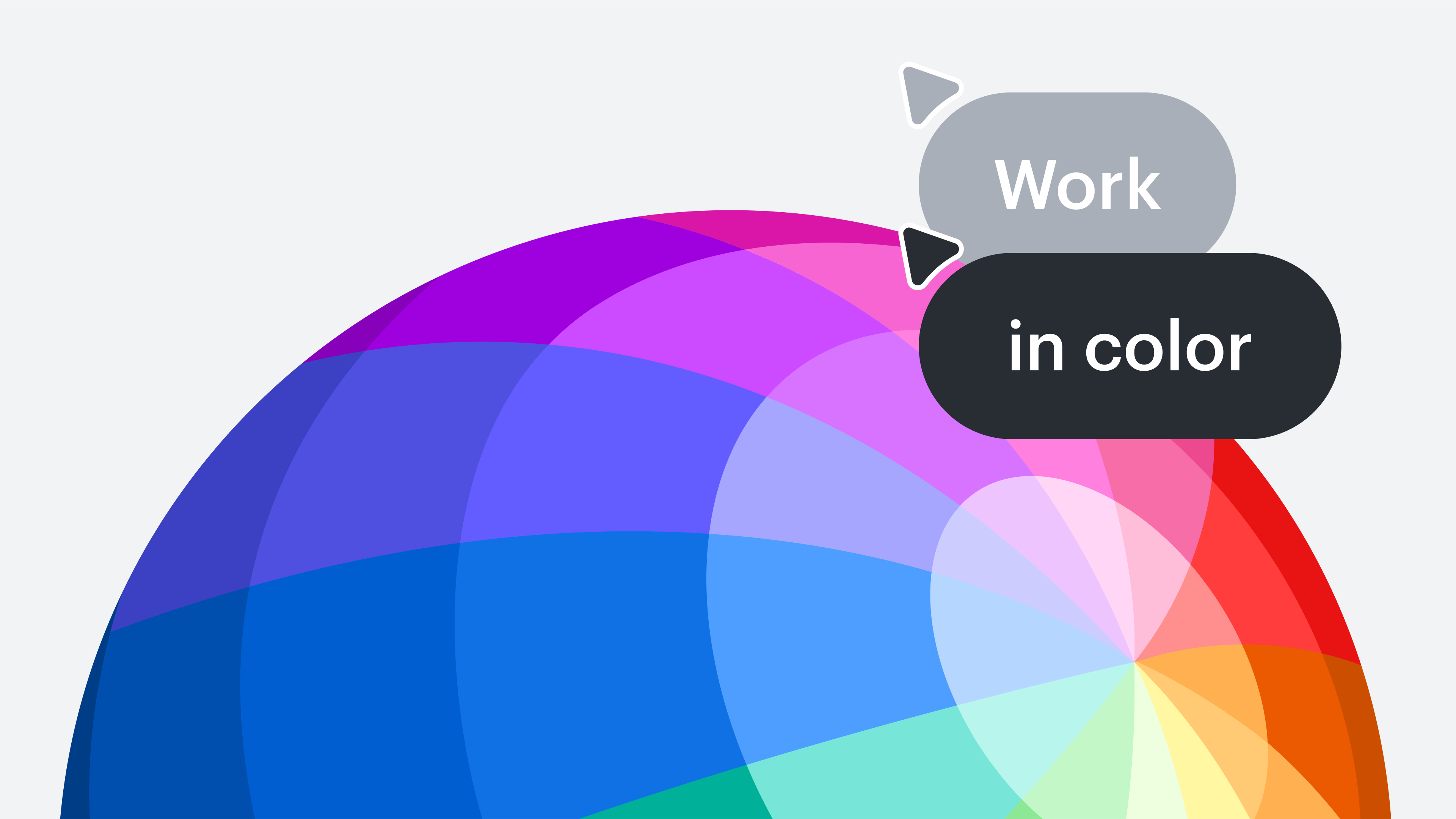
Unlocking the power of color in collaboration
Uncover the psychology behind color and get expert tips on using warm, cool, and neutral colors in a virtual workspace to boost engagement and efficiency.
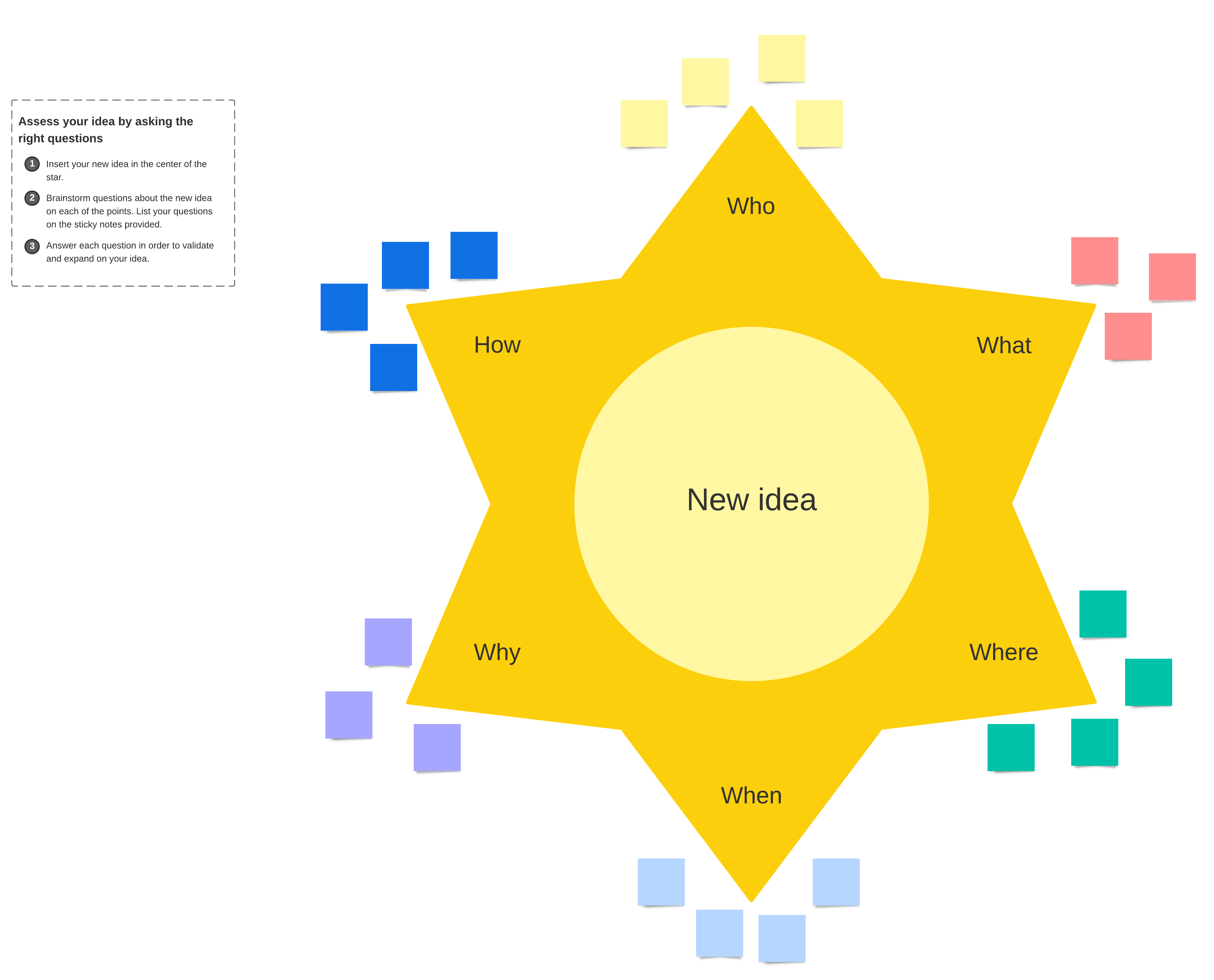
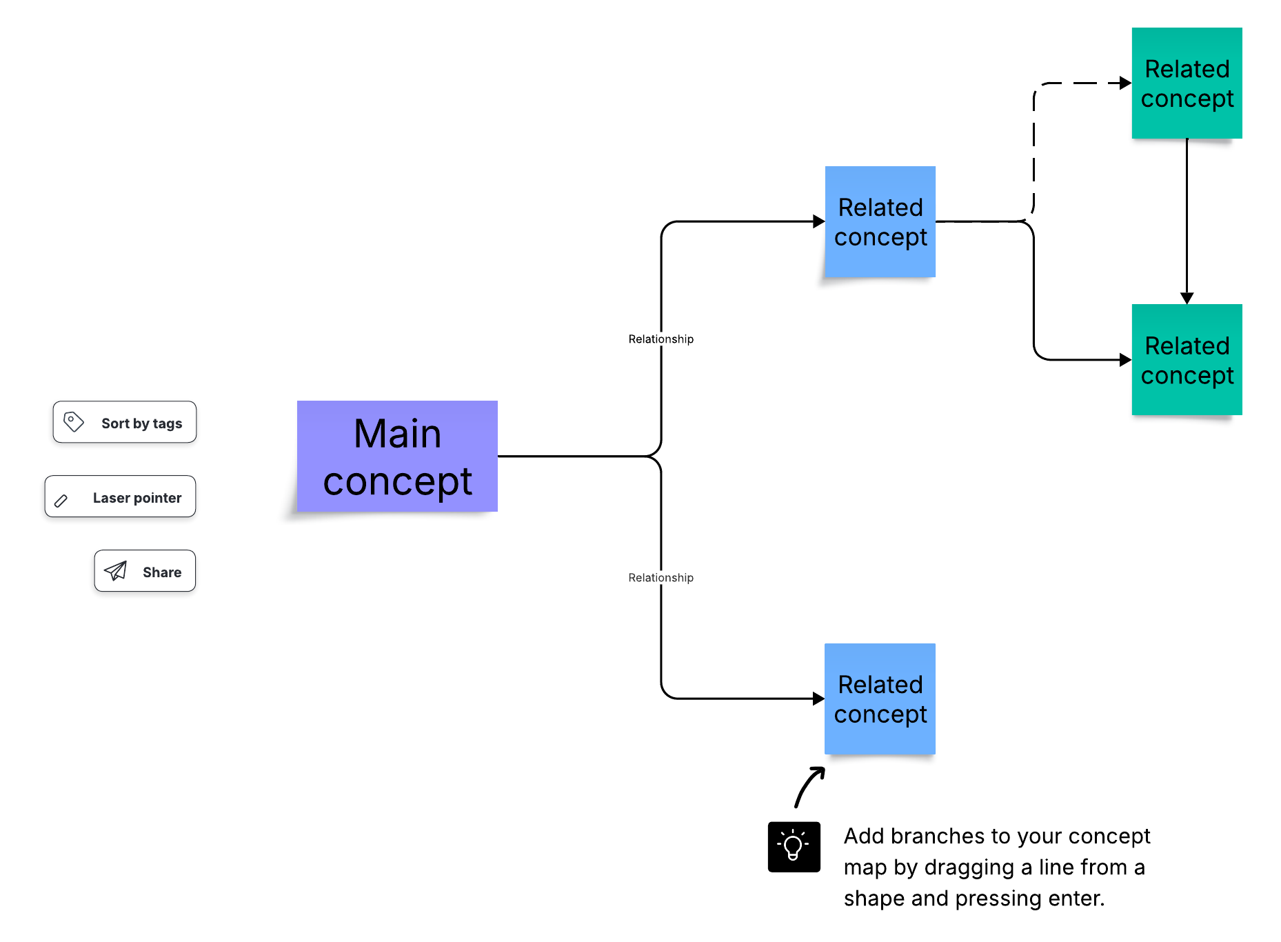
11+ features to organize your Lucid canvas for diagramming and brainstorming
Explore 11+ features that make it easy to take your work from chaotic to clean in Lucid.
4 visual collaboration tips to boost team engagement and productivity
In this blog post, we’ll uncover the benefits of visual collaboration and provide tips for collaborating visually with your team.
Tips for better online collaboration
Any virtual meeting can be a collaborative experience, but you can avoid common meeting pitfalls by leveraging the advantages of online communication. Use these online collaboration tips to get started.