lucid icons and illustrations

How to keep your Lucid documents organized with icons and illustrations

Natalie null

Reading time: about 3 min

Topics:
  • Visual collaboration

Interested in upleveling your Lucid document organization? 

Here are some tips and tricks for creating organized and aesthetically pleasing documents. Whether you're a seasoned designer, a project manager, or simply someone who appreciates a well-structured document, this article is for you.

Using visuals for quick highlighting

Sometimes, we zoom out on our Lucid documents to see a bigger picture. Then, text placeholders become too small to read, making it difficult to understand where each point is located. For cases like that, you can use bright and noticeable illustrations that will give you a reference for what each sticky note or section is about.

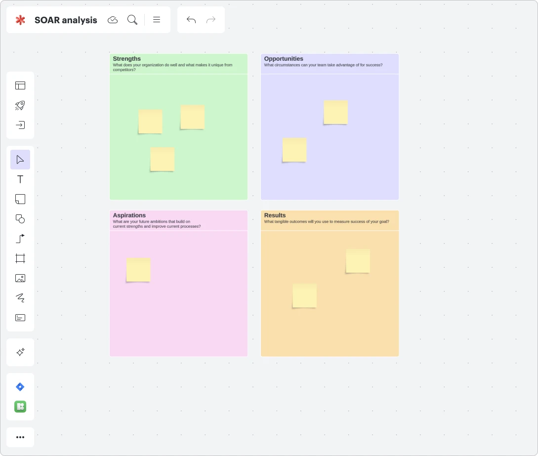
For example, say we need to visualize our company’s SOAR analysis.

To do so, we go straight to Lucidspark and create a document. Lucid has a huge template library, so we will use the one that best suits our task, but if you need something more unique, you can create your document from scratch.

Lucidspark SOAR analysis template with four quadrants labeled strengths, opportunities, aspirations, and results

Now, our SOAR sections are ready to fill with sticky notes. Make sure you fill each section with a different background color to differentiate them. Next, let’s make the purpose of the section even more clear with the help of illustrations. For this, we launch the Icons8 plugin and click on the “Illustrations” tab.

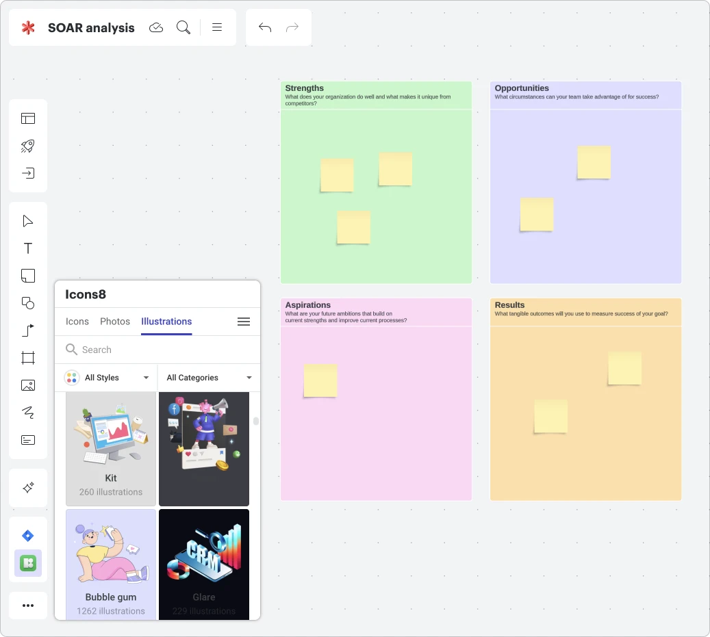
View of Icons8 plugin within a Lucidspark document; illustrations shown are Kit with 260 illustrations and Bubble gum with 1262 illustrations

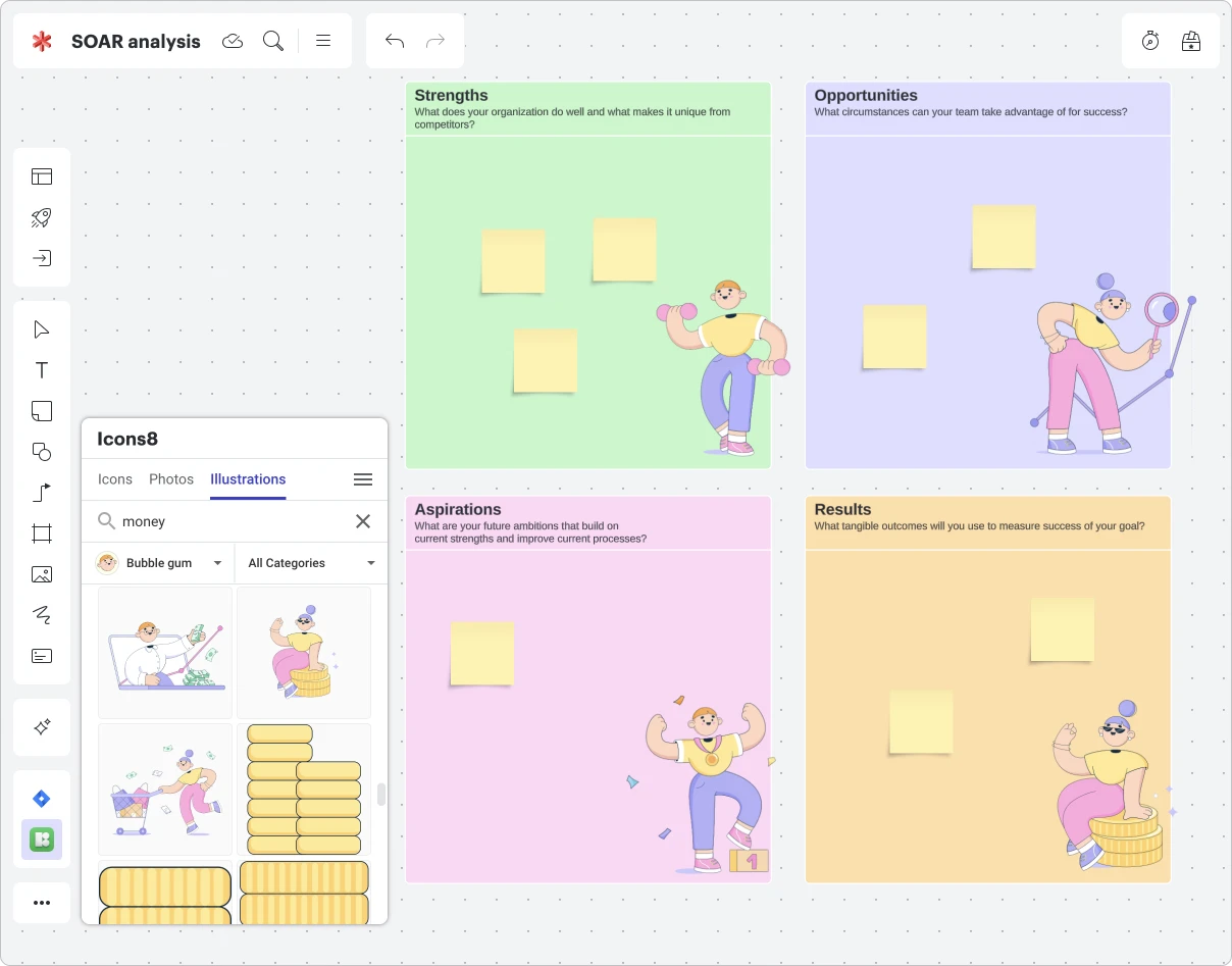
Style “bubble gum“ seems like a good fit based on the colors we have chosen for our section’s background. We dive into the style and search for images based on the associations. In this case, the keywords we used were “physics” for the strengths section, “search” for the opportunities section, “reward” for the aspirations section, and “money” for the results section.

SOAR analysis template with Bubble gum style illustrations added to each section

Done! Now it is clear what each section is about, even if we set the scale of the document to the minimum. Take a look:
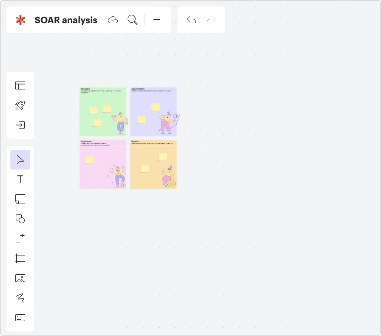
Zoomed out view of SOAR analysis template in Lucidspark

Placing icons to make charts more illustrative 

To describe complex processes, we often use charts and block schemes. To make them more illustrative, try to put pictograms inside blocks.

For example, we will use this nice-looking brainstorming session template in Lucidchart.
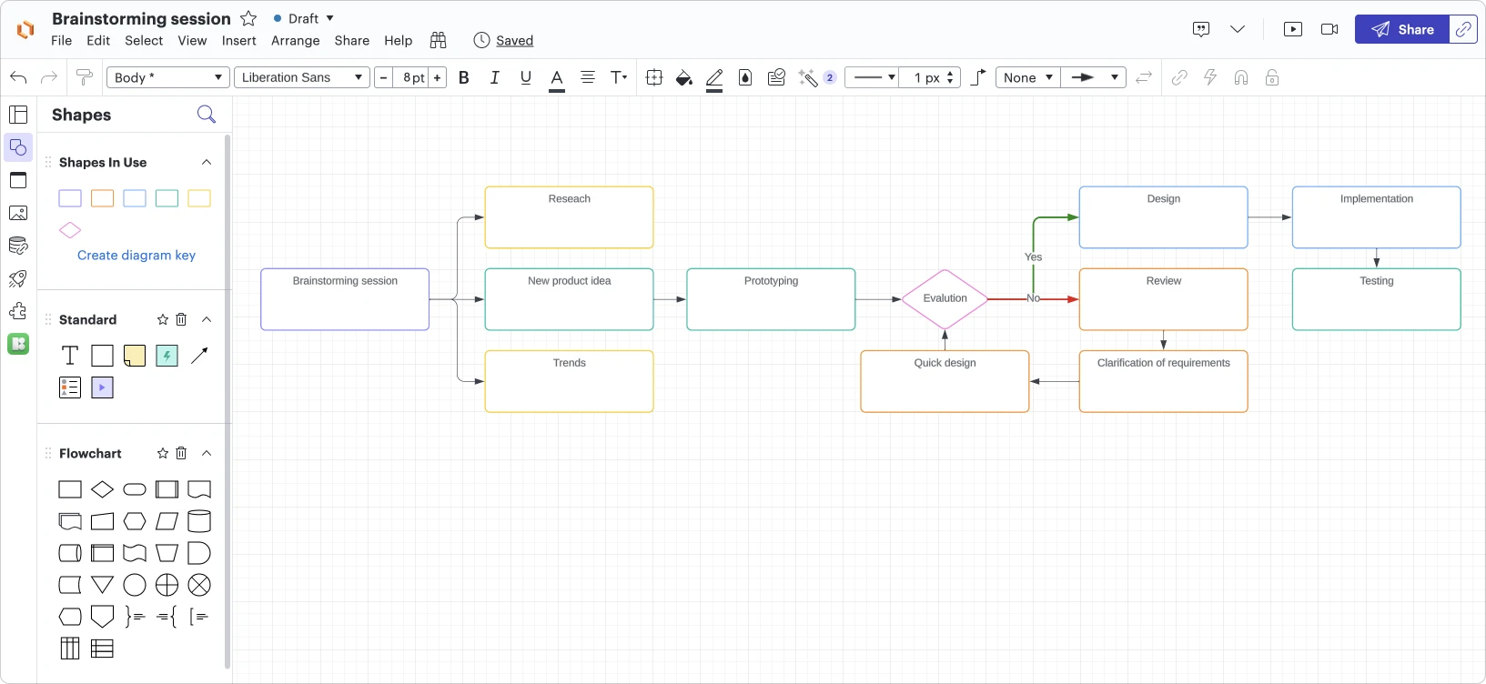
lucidchart brainstorming template with shapes and arrows

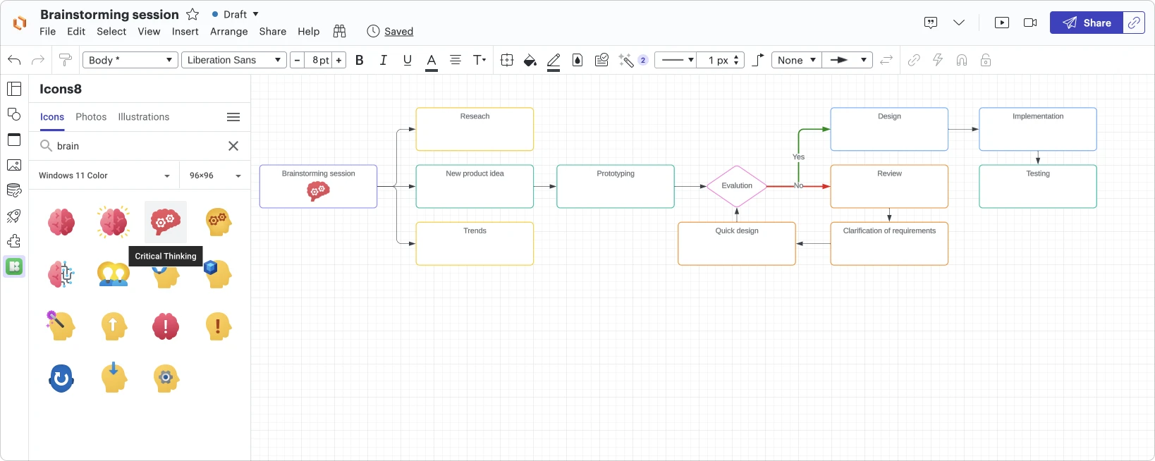
Then, we will go to the Icons8 plugin again. For documents like this one, it may be good to go with the colorful but not too artistic options when choosing image style. Icons from the classic Windows 11 color style will be a perfect fit. There is a “critical thinking” icon that will look good in the first block.

choosing a critical thinking icon in lucidchart with the icons8 plugin

A few fixes and tweaks and voilà! Not only is our block scheme clear and informative, but it also looks vibrant and interesting.
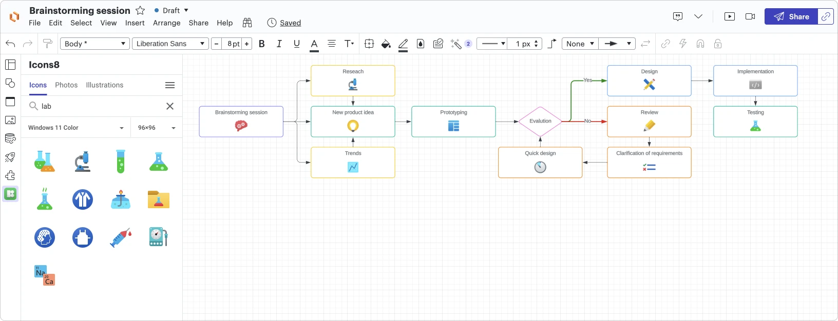
Lucidchart brainstorming session template including icons from the icons8 plugin in each shape

Tell the story using photos

Using people's faces in your storytelling docs is good for when you want to appeal to your audience. Take structuring this presentation, for example.
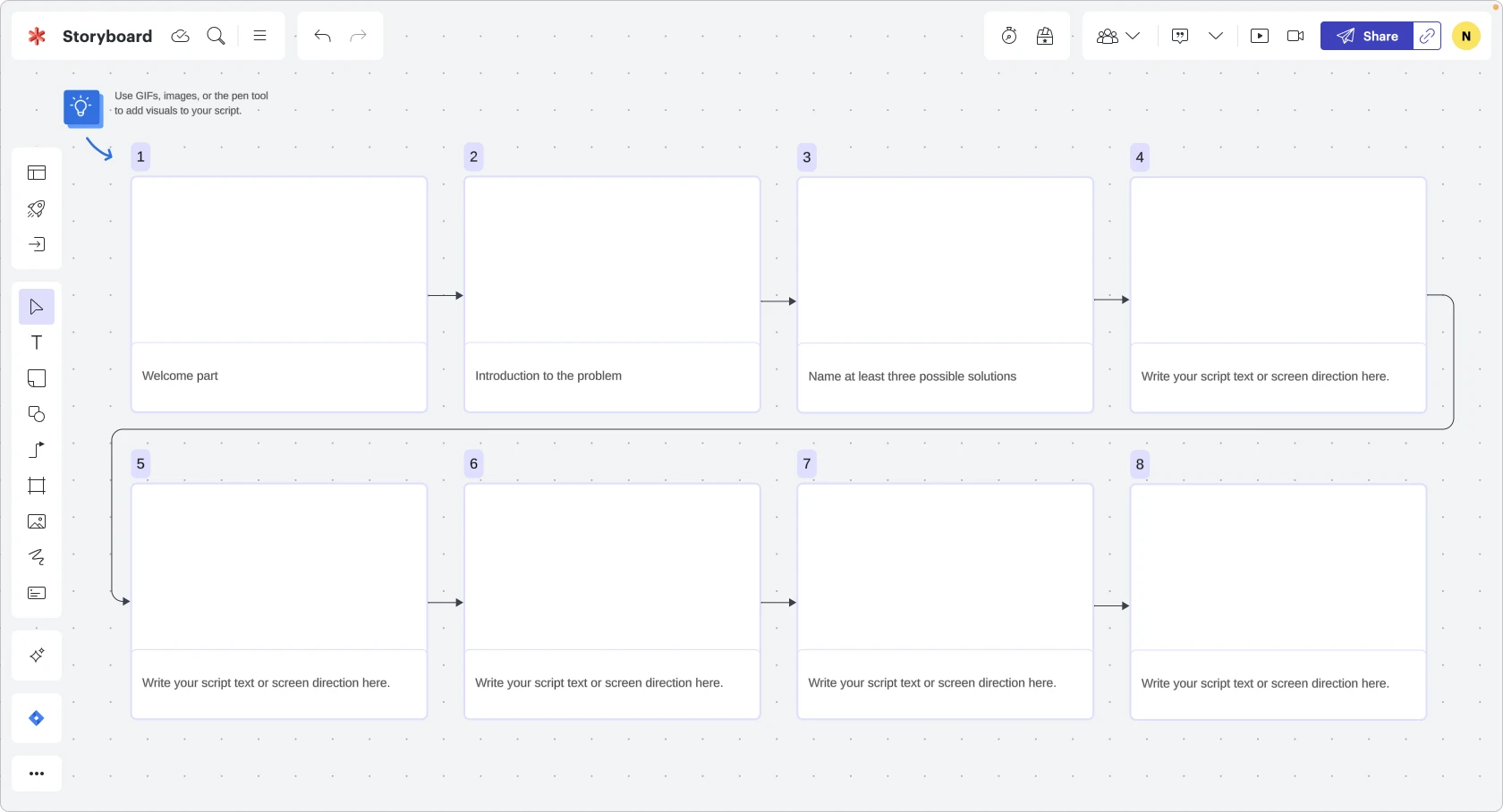
Lucidspark storyboard example

Let’s fill it in with some nice photos from the Icons8 plugin:
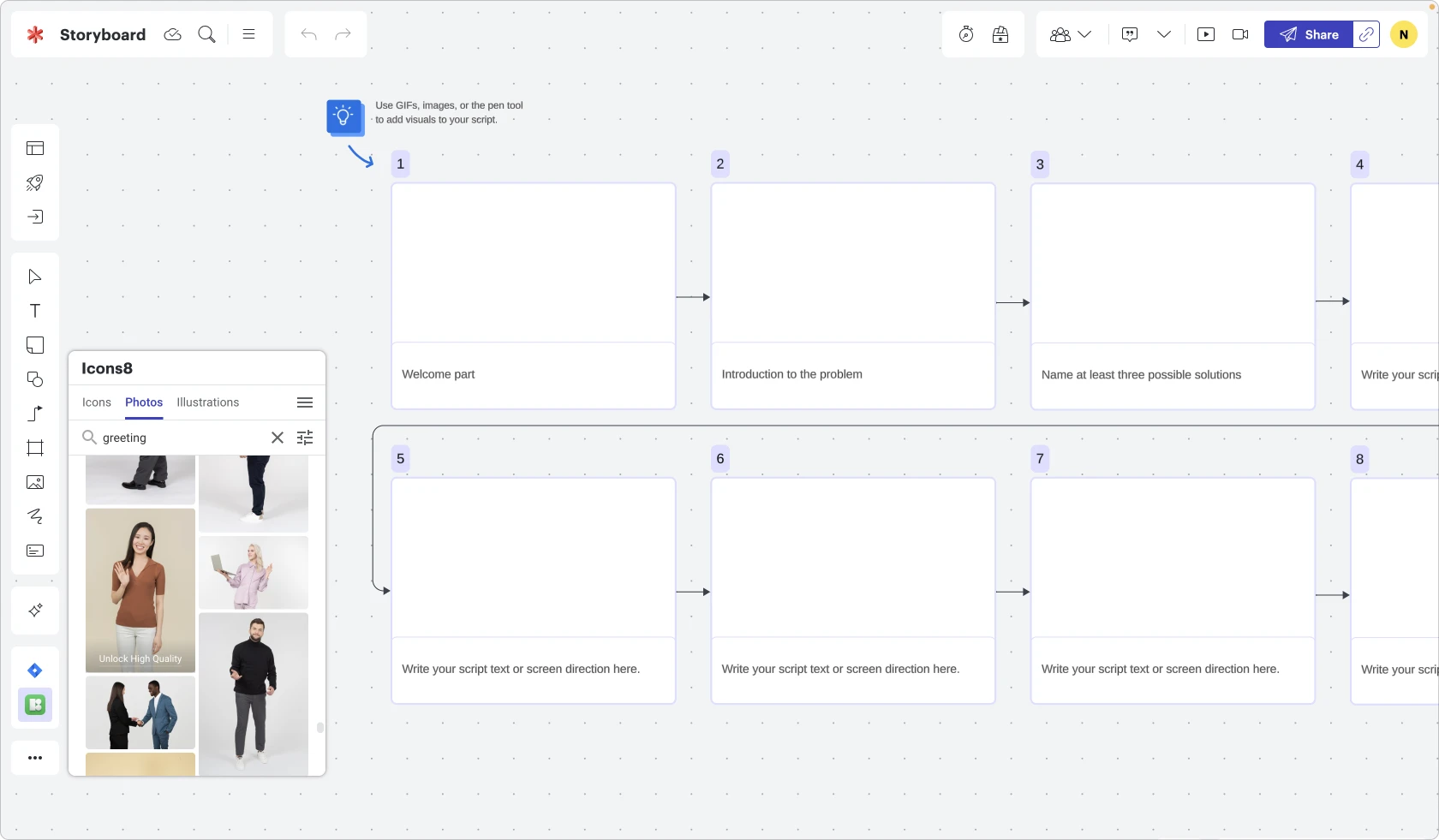
icons8 plugin view of choosing photos to add to Lucidspark board

You could choose photos with similar color sets to bring more consistency to your document

lucidspark storyboard with photos added

And here it is! Now, it will be easier for your colleagues to memorize the structure of the presentation since written titles can sometimes slip from your mind easily, but images stick better.

These examples are not the only cases when graphics can complement your Lucid documents. There is always room for your imagination. Business documents should never be boring, right?


Lucid universal canvas

Connect the Icons8 plugin to Lucid to get started adding icons and illustrations to your Lucid documents. 

Connect now

About the author

Natalie is a content marketing specialist with more than 10 years of experience. She is currently working at Icons8. The company creates diverse digital design assets and tools for graphic, web, and UI/UX design professionals.

About Lucid

Lucid Software is a pioneer and leader in visual collaboration dedicated to helping teams build the future. With its products—Lucidchart, Lucidspark, and Lucidscale—teams are supported from ideation to execution and are empowered to align around a shared vision, clarify complexity, and collaborate visually, no matter where they are. Lucid is proud to serve top businesses around the world, including customers such as Google, GE, and NBC Universal, and 99% of the Fortune 500. Lucid partners with industry leaders, including Google, Atlassian, and Microsoft. Since its founding, Lucid has received numerous awards for its products, business, and workplace culture. For more information, visit lucid.co.

Bring your bright ideas to life.

Sign up free

or continue with

Sign in with GoogleSign inSign in with MicrosoftSign inSign in with SlackSign in

By registering, you agree to our Terms of Service and you acknowledge that you have read and understand our Privacy Policy.

Get Started

  • Contact Sales

Products

  • Lucidspark
  • Lucidchart
  • Lucidscale
PrivacyLegalCookie privacy choicesCookie policy
  • linkedin
  • twitter
  • instagram
  • facebook
  • youtube
  • glassdoor
  • tiktok

© 2024 Lucid Software Inc.