powerpoint

Collaboration reinvention: PowerPoint pitfalls

Reading time: about 11 min

Topics:

  • Collaboration skills
  • Visual collaboration

Sure—you collaborate. Been there, done that. You may feel confident that your icebreakers and conference room brainstorming sessions have checked off all the boxes (and hey, they’re a start!). But the truth is that effective collaboration is an ongoing process that’s less about increased activity and more about increased impact. It’s an individual and organizational skill set that demands strategy and creativity. And it should adapt as your business needs change.

The workforce has changed dramatically in the past several years, but the way teams collaborate largely hasn’t. Many are working with outdated processes that are slowing them down and, quite frankly, preventing growth. Collaboration should be treated with the same rigor and intention of any large-scale business initiative—and if you’re not continually refining and improving your team’s collaboration techniques, then you aren’t doing it right.

We’re excited to announce a new series of articles that will help you rethink your outdated tools and find better solutions to harness your team’s collaborative synergy. It’s time to ditch the antiquated ideologies of yesteryear and say hello to a new era of strategic, impactful collaboration. And we’ll be your guide.

Today’s topic: the endless monotony that is PowerPoint presentations

Did you know PowerPoint just celebrated its 35th birthday? And outside of aesthetic changes, the basic functionality of the software largely has not changed. PowerPoint has somehow remained virtually untouched in the presentation-sharing space, despite the fact that it’s likely one of the first pieces of software you learned about in your elementary school’s computer class. But while you’ve advanced since then, PowerPoint really hasn’t.

PowerPoint is the perfect example of a software that you may not even question in your tech stack. And don’t get us wrong: It has its place. But just because you’ve been using it so long, is it really the best tool to get the job done?

Why is PowerPoint so bad?

Great question. While PowerPoint itself isn’t bad, it turns out that there are actually several problems with the way it’s often used. Traditionally, a team member may turn to PowerPoint for one of two reasons: to pitch ideas or to share information. We’re not convinced it’s the best tool for either. Here’s why:

1. It’s not interactive

PowerPoints are often used to make business pitches or lead discussions, but the chat is just one-sided. It's wholly presenter-focused. Sure, you may be able to leave comments on the slide deck itself, but there really is no great way within the platform to collaboratively capture feedback and make a plan for steps forward. You either have to collect feedback verbally, which results in lost insight that can’t accurately be referred to later, or you have to take notes, which calls for additional tools that further silo your information.

So, yes, PowerPoints can be useful for knowledge sharing, but not for facilitating and documenting real discussions that drive informed decision-making later.

2. It’s time-consuming

PowerPoint presentations use a very specific structure, and it’s creating more work for you. It’s unlikely that you have deliverables that transfer easily to a slide. This means that after you’ve collected data and information to present, you then have a whole additional step of creating each slide individually from scratch. You are losing time and content impact by not using materials that have already been built.

3. It’s boring

Or, it can be. The PowerPoint format can feel quite static, especially when the creator isn’t familiar with or especially skilled at creating presentations. Even the most dynamic presentations don’t offer that much flexibility. At best, they may have some color and images, but at worst, they’re a boring canvas often read word for word. And when you’re trying to set your team up to brainstorm brilliant insights and ideas, boomerang slide transitions will go only get you so far.

4. It dilutes information

PowerPoint presentations have always been more about visual appeal than the transfer of information. That’s why your important data points are reduced to bulleted highlights, usually getting watered down or cut in the process. Because of this, a presenter really needs to walk you through the slides in order for you to fully understand their context and meaning, or else you easily miss key information that would affect decision-making and feedback loops.

Or, in some cases, something even worse could occur. Richard Feynman, CalTech physicist, recognized that “bulletized” thinking contributed to the Challenger disaster of 1986. According to Feynman, “The big problem was that NASA management wasn’t really listening to engineers—and breaking up issues into bullets helped them do that.” Several years later, combat commander H. R. McMaster banned PowerPoint in Iraq, when he recognized it promoted messaging that was too vague to be secure amidst critical missions. The message is clear: When important (even life-saving) data is reduced to mere bullet points, you likely cut out valuable—or even critical—information.

PowerPoint vs. Lucid: Why Lucid takes the lead in modern workplaces

It’s time to break up with PowerPoint and try out something smarter. It’s not us, PowerPoint. It’s you.

Lucid has several tools that will make your presentations more data-driven, efficient, impactful, and collaborative. In short, it checks all the boxes that PowerPoint doesn’t.

powerpoint
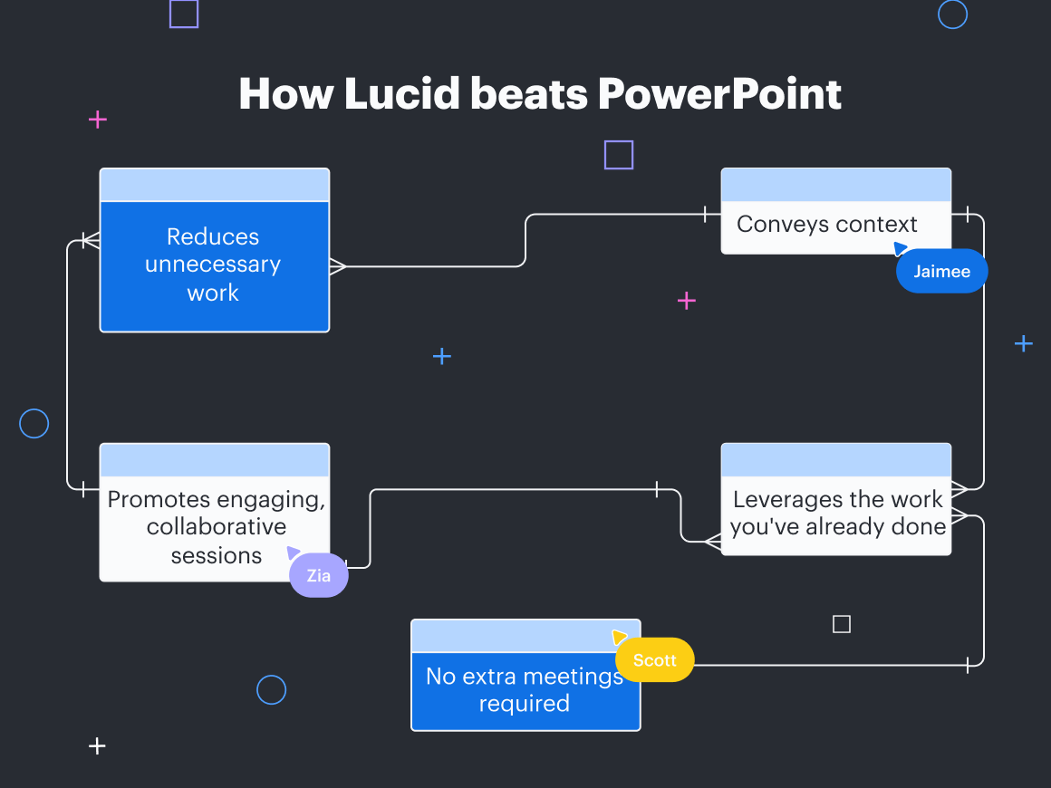
How Lucid beats PowerPoint

1. It reduces unnecessary work

Creating a slide deck doesn’t need to be a separate step. Use Presentation Mode in Lucidchart or Lucidspark to utilize the information you’ve already collected and present it in just a few extra clicks.

Presentation Mode will intuitively group information together in separate slides, so rather than starting a presentation from scratch, you’ll just need to confirm the slide containers (making adjustments as needed), and you’re good to go. Save yourself time and effort by leveraging the work you’ve already done.

2. It inherently conveys context

We’ve all experienced the frustrating reality of trying to interpret a PowerPoint presentation sent without adequate context. Maybe you missed a meeting and are trying to get aligned, or you’re attempting to learn about a new product or process. It can be difficult—or near impossible—to glean value from slide decks when you’re reviewing them without someone to provide context or an explanation.

Not anymore. Lucidspark and Lucidchart make it easy to convey context, so they stand on their own.

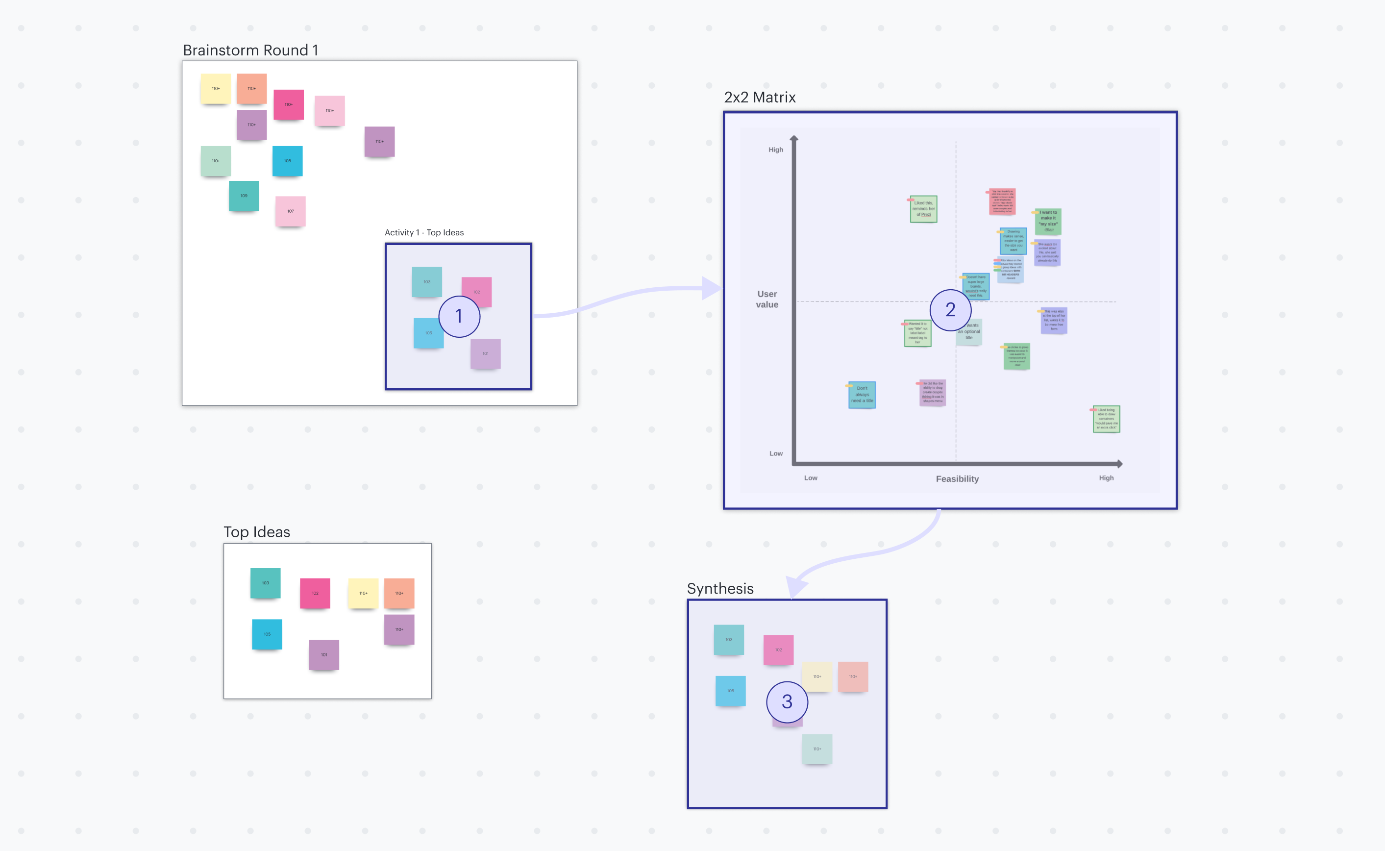
While Presentation Mode is best for presenting asynchronously with a facilitator, Frames are perfect for sharing slide decks with team members to review individually on their own time, without losing context or value.

After creating a Lucidspark board, draw a frame around the information you’d like to be included in a presentation. Title the frame, style it, and add any details you’d like to it. Don’t reinvent the wheel—creating slides should truly be as simple as dragging your mouse. 

Once you have frames around the content you’d like to present, add a Path to guide your audience from frame to frame. You can even create multiple paths on the same Lucidspark board so that different audiences will experience your content exactly in the way you’d like them to. Perfectly tailor decks to stakeholders to increase buy-in and save time by directly addressing their needs. Finish up the process by either sharing the specific path’s link or walking through one in real time during a meeting.

Of course, the larger (and more detailed) your board is, the more complex it becomes to navigate. If a team member was sent a link without context, they might naturally feel overwhelmed, unsure of how to find what they’re looking for. That’s where the Table of Contents comes in. To access a particular frame, simply utilize the feature to view all the frames you’ve created and swiftly navigate to the one you’d like.

powerpoint
Paths example

3. It promotes engaging, collaborative sessions

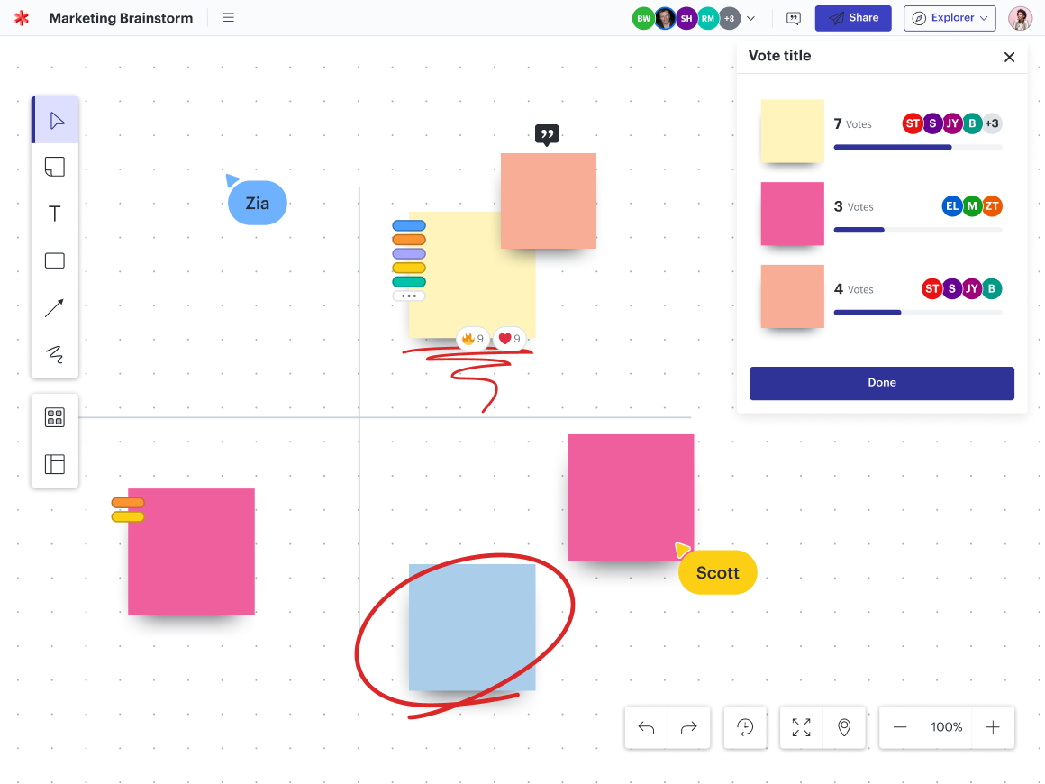
According to a recent study by Harvard, 90% of individuals have multi-tasked during virtual meetings. Why? When facilitated incorrectly, they tend to be ineffective, one-sided, and just plain boring. Lucid’s many interactive elements make it easy to actively engage participants, quickly gather feedback, and ensure all voices are heard. Voting sessions are a great place to start.

Voting sessions in Lucidspark drive participation and provide a way for you to learn more about your participants so you can adapt the material to them while you present. For example, maybe you want to find out how much participants already know about a topic so you can spend the most time on the newest material, or you’d like to gauge their interest in the presentation, so you can change things up to drive further participation. Voting sessions can help you check the pulse of the meeting, so you can pivot if necessary to facilitate a successful meeting.

There are a few different types of voting depending your use case. Use private voting to vote anonymously and ensure you’re getting true opinions. This is especially useful if you’re seeking context on something you anticipate your team will feel split on or if you have more tentative personalities on your team. Try selection voting to keep users focused on a specific topic when you need a deeper dive into a particular category. Or, choose persistent voting to keep results displayed on your Lucidspark board even after voting has ended so that the results can drive discussion and decision-making throughout the rest of the meeting.

Plus, with emoji and GIPHY reactions, participants can leave honest feedback on ideas and comments in an authentic, informal way. That way, the discussion is open for more honest, genuine reflection.

powerpoint
Voting session example

4. It leverages the work you’ve already done

PowerPoint requires you to collect content and data, edit it down into bullet points, and then create individual slides. But Lucid documents leverage the work you’ve already done, cutting down unnecessary work and saving you time. 

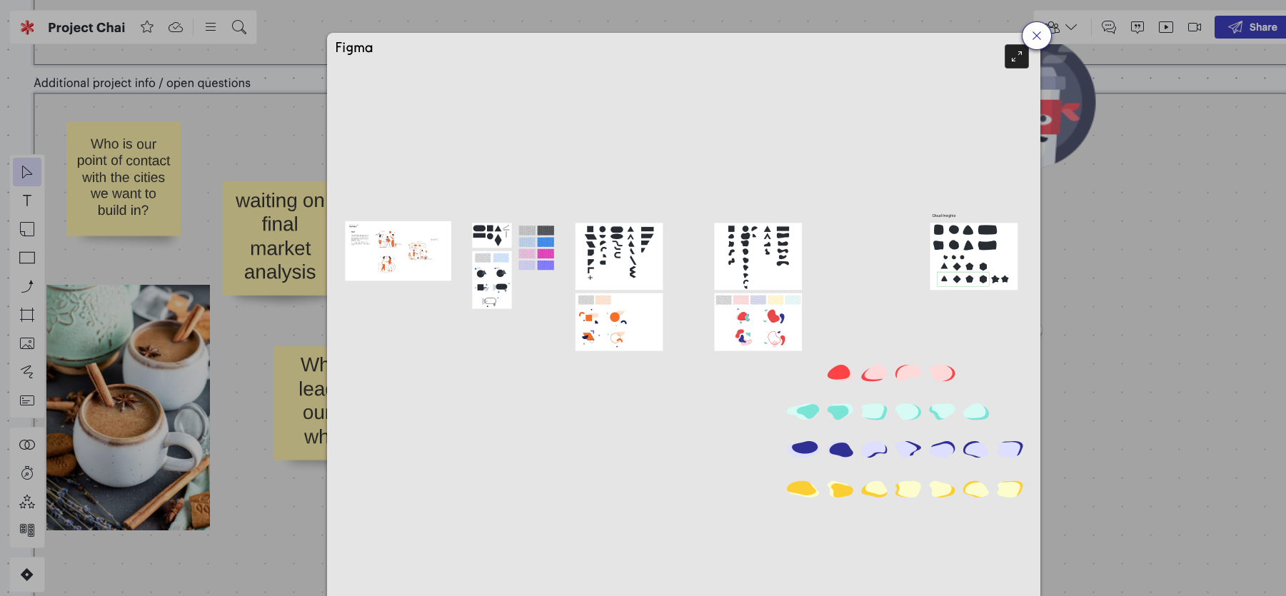
Import data sets from Google Sheets, Excel spreadsheets, and CSVs into Lucidchart and use them to create insightful, data-driven presentations. You can even take advantage of our automation features for your data to update in real time, so you always have the most up-to-date information at your fingertips. This cuts down on additional steps later to update or make edits to your slide deck because you’ll always have the most relevant version ready to present. Plus, easily link to additional resources (embedded videos, hyperlinks, diagrams, and more) so your information won’t get diluted like it often does with PowerPoint.

powerpoint
Embed integration example

5. It stands on its own: no extra meeting required

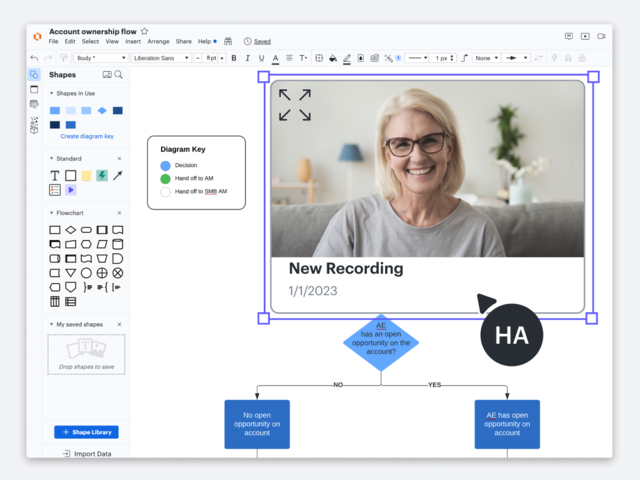
Our integrations make it easier than ever to share your work. Bring more context to remote work in new ways with our CloudApp and Loom integrations. Record, insert, and play videos directly in your Lucidspark boards. You don’t need to schedule another meeting—instead, leave your team members with clarity, direction, and insight to better interpret the material through a short directional video. CloudApp and Loom will help you turn your presentation into something that’s easily usable afterward, so it retains value as it is shared with team members who are viewing it for the first time.

And while sharing PowerPoint presentations can be finicky at best, Lucid documents are easily shared through Google Calendar invites. Simply attach a Lucidspark board link to the invite, so attendees can either brief themselves prior to attending or show up ready to do their best work in one big asynchronous workspace.
 

powerpoint
Video integration example

A quick note to PowerPoint loyalists

Maybe you understand its weaknesses and even acknowledge it can be antiquated, but you still don’t feel like you can fully break up from PowerPoint. We get it. Whether your organization is especially dedicated to Microsoft Office and you don’t see that changing anytime soon or you have certain use cases you like using the software for, you’ll still benefit from incorporating Lucid into your workflow.

In just a few seconds, you can insert a static or dynamic Lucidchart diagram directly into your PowerPoint presentation to convey more comprehensive data. Create, edit, and share visuals right in your slide deck. Or collaboratively diagram directly in Microsoft Teams.

You’ve grown—so should your tech stack

PowerPoint presentations work well for a very specific use case, but it’s likely you’re using them in ways they weren’t intended to be used. And your team’s collaboration (and efficiency) is suffering in the process. It’s time to graduate from the same slide deck software you’ve been using since elementary school and approach your tech stack intentionally to ensure you’re using the right solution for each job. 

Try Lucid instead. Our many integrations, countless features, and hundreds of templates provide you with endless opportunities to align your team, so you can empower members and ensure you’re getting their best. And with continual updates and new offerings, you’ll approach projects confidently, knowing you’re always getting the best out there.

Lucid universal canvas

Explore more tips to improve your collaboration.

Read more

About Lucid

Lucid Software is a pioneer and leader in visual collaboration dedicated to helping teams build the future. With its products—Lucidchart, Lucidspark, and Lucidscale—teams are supported from ideation to execution and are empowered to align around a shared vision, clarify complexity, and collaborate visually, no matter where they are. Lucid is proud to serve top businesses around the world, including customers such as Google, GE, and NBC Universal, and 99% of the Fortune 500. Lucid partners with industry leaders, including Google, Atlassian, and Microsoft. Since its founding, Lucid has received numerous awards for its products, business, and workplace culture. For more information, visit lucid.co.

Related articles

  • 3 anti-patterns holding you back from better collaboration

    If you’re feeling like collaboration is lacking on your team, approaching improvement by identifying and tackling anti-patterns can be a helpful framework.

  • Empower teams to work in new ways with visual collaboration

    Let's explore how visual collaboration is empowering people to work in new and more productive ways and how you can begin to implement this practice on your own team.

  • Beyond the buzzword: What is visual collaboration?

    It’s time we stop treating visual collaboration like a buzzword. Defined properly, it's the key to aligning teams and accelerating innovation.

  • Top 6 signs your collaboration needs an overhaul

    Learn signs that your collaboration may not be as effective as it could be, plus explore resources to get the best results possible.

Bring your bright ideas to life.

Sign up free

or continue with

Sign in with GoogleSign inSign in with MicrosoftSign inSign in with SlackSign in

By registering, you agree to our Terms of Service and you acknowledge that you have read and understand our Privacy Policy.

Solutions

  • Digital transformation
  • Cloud migration
  • New product development
  • Efficiency through AI
  • View more

Resources

  • Customers
  • Developers
  • Security
  • Support
  • Learning campus
  • Community
  • Partners
  • Newsletter
PrivacyLegalCookie privacy choicesCookie policy

© 2024 Lucid Software Inc.