Every company operates around objectives and uses key performance indicators (KPIs) to track progress towards those objectives. For each goal, there are two main questions teams should easily be able to answer at any time:
How much progress have we made so far?
Are we on track to hit the goal?
Data dashboards are a great medium to provide on-demand answers to these questions. There are multiple enterprise-grade data visualization products out there, but sometimes a simple spreadsheet, if used right, can do the job just as well. After reading this article, you’ll learn how you can push Google Sheets to its limits to make professional-looking data dashboards. We won’t be using any third-party tools or services here—just Google Sheets out of the box, which makes this tutorial applicable to a wide variety of contexts.Note: The tutorial assumes basic familiarity with Google Sheets or a similar spreadsheet app.Let’s define a test project we’re going to work with. Suppose your team just launched a new app (or blog post, landing page, email campaign, etc.). No project is worthy of itself if it doesn’t have a business goal, so you set one:
Reach 500 installs in the first 3 months.
This goal will be your team’s success metric that you will include in reports to stakeholders and review at staff meetings. Experience has taught you that in order to drastically increase your chances for success, you need to consistently track progress. This idea brings us to the obvious first step.
Step 1: Begin tracking
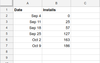
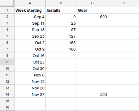
Let’s start a new spreadsheet to track the number of installs of the app over time.Weekly app installs spreadsheetIn this example we’ll be tracking our metric, the number of installs, weekly, updating it every Monday. For simplicity, we’ll pretend that we launched the app on September 4, 2017, which is the first Monday of the month.What this gives us: We can now easily answer questions such as, “How many installs did we reach last week?” We can also look up the number for earlier weeks. However, raw data doesn’t offer any kind of actionable insight and isn’t something you want to present to stakeholders. Let’s move on.
Step 2: Create your first chart
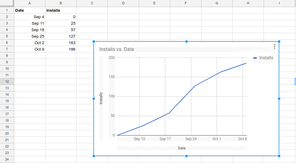
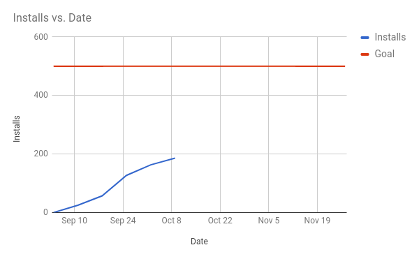
Let’s begin harnessing the power of visual communication by creating our first chart. Here is the default chart (a line graph in this case) that Google Sheets produced for me:Data spreadsheet with a goal column
Unfortunately, this is where many people stop and include the chart as is when communicating results.
What this gives us: The chart helps us better visualize the growth trend, but we still have no idea if we’re on track to hit the goal. In fact, so far the goal (500 installs) isn’t represented anywhere on the spreadsheet or the graph. Let’s fix that.
Step 3: Show the goal
Here’s the (self-coined) Golden Rule of Data Visualization:
Data visualization should be self-sufficient and self-explanatory.
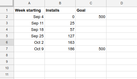
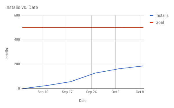
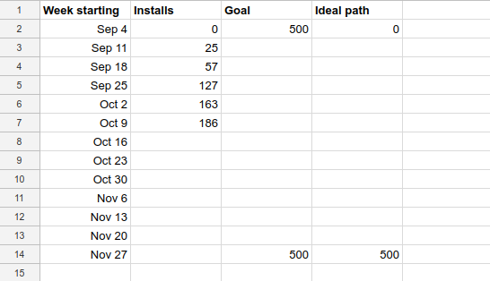
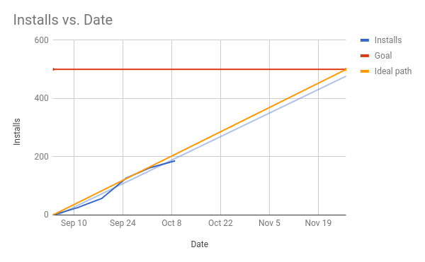
In other words, the data dashboard chart should be easy to understand and contain all the information about the performance of the metric(s) being tracked. In our case, the chart must include the goal.Let’s add a new Goal column and add it into the chart’s data range. Check the checkbox Plot null values (in Chart style) so that the first and the last data points in the Goal column get connected with a solid line.Data spreadsheet with a goal column and the date column pre-populated until the end of the period in question.Chart with a goal line visible. Note: I also changed the maximum value on the vertical axis to be 600 so that the goal line isn’t sticking to the top border of the graph.What this gives us: Adding the goal-line provides an important context to our metric. We can now see how far we are from the target.
Step 4: Make sure you include the entire goal
Let’s review our goal one more time:
Reach 500 installs in the first 3 months
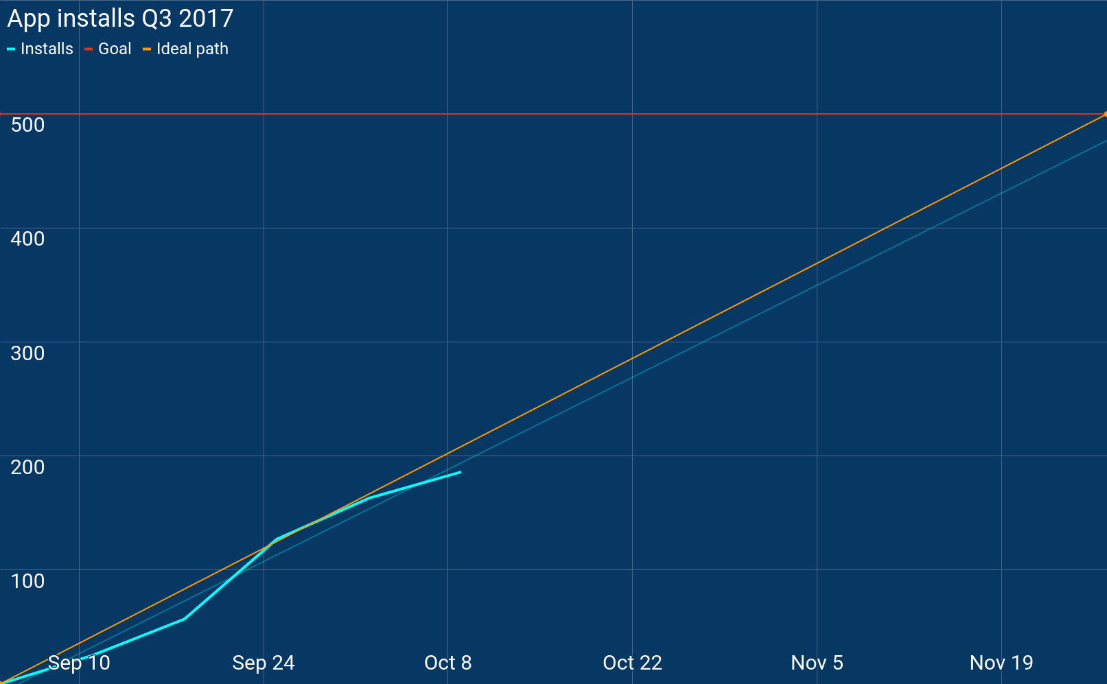
Our data dashboard already visualizes the target number of installs, but the second part of the goal hasn’t been captured yet. The chart always ends at the last data point available and doesn’t show how much time is left. Consequently, we still can’t answer the simple business question posed in the beginning: “Are we on track to hit the goal?”We need to have the chart show the entire time period defined in the goal statement. To do this, we’ll populate the date column all the way until the end of the period in question.Data spreadsheet with a goal column and the date column pre-populated until the end of the period in question.The chart now looks like this:Chart with a goal line and the entire time period capturedWhat this gives us: Finally, the data dashboard accurately captures our business goal in two dimensions—it not only tells us how far we are from the goal but also how much time is left to reach it.
Step 5: Visualize the trend
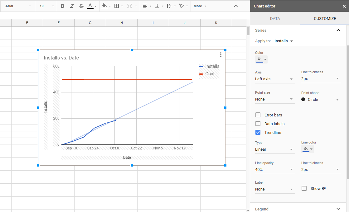
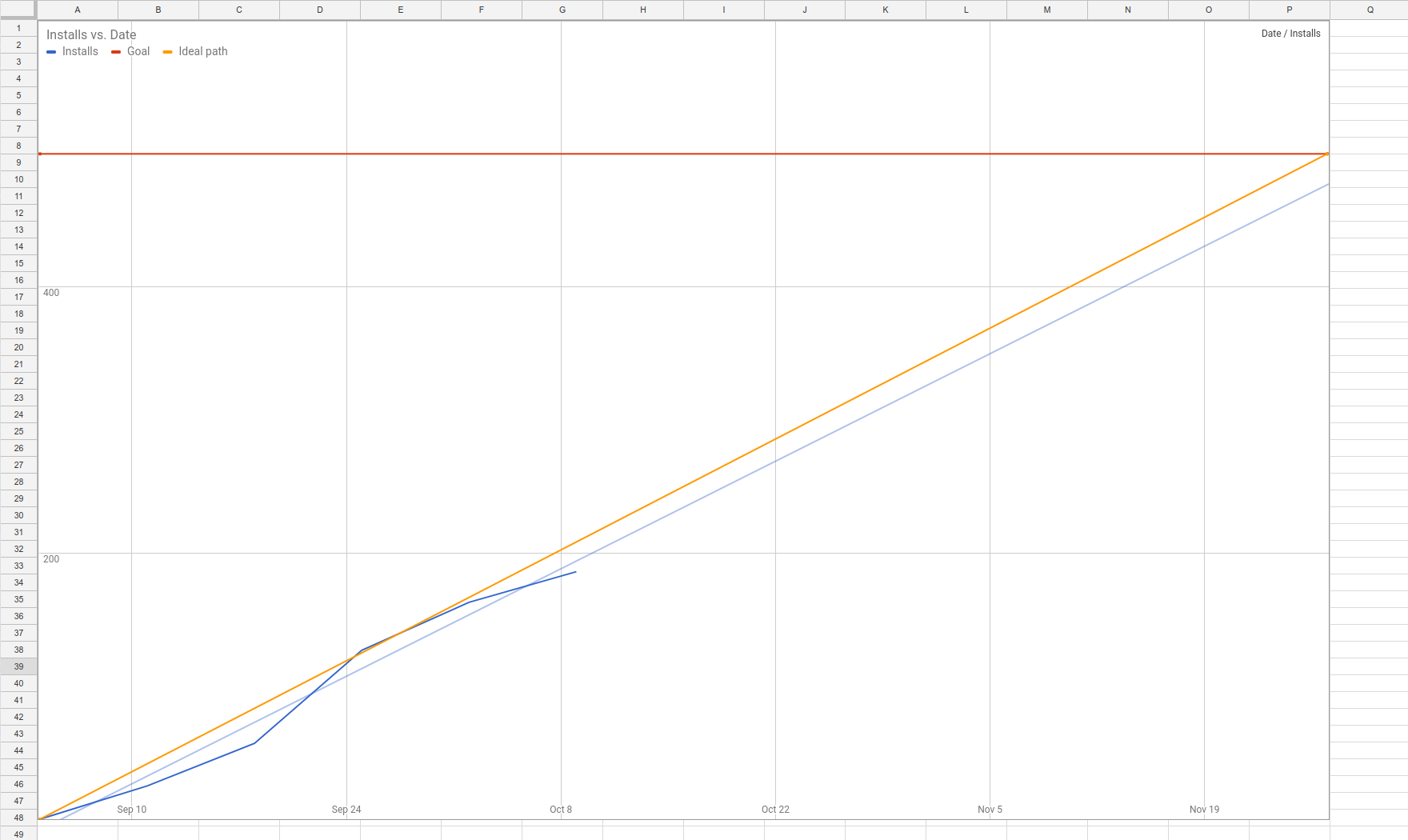
While our data dashboard is already very informative, it may still be hard to gauge how many installs we’re going to have by the end of the time period, provided we continue at the same rate. We can have Google Sheets use simple mathematical extrapolation to “predict” how our metric will behave in the future based on existing data points. Easily enable this prediction by checking the “Trendline” checkbox for the corresponding data series:Chart with a linear trendline enabled for the Installs data seriesNow the chart tells us that we’ll fall just a little short of our goal if the installs growth continues at the same pace. You can experiment with different types of interpolation, but I just set it to Linear for this example. Just note that this is a very primitive method of predicting the future trend and will not work for all kinds of data, but I’ve found it useful in a number of situations.We can also get more sophisticated and add the “ideal path to goal” to the chart. To do this, let’s add a new data column that will describe the ideal trajectory to the goal:We can now see how much the trendline deviates from the “ideal path.”What this gives us: After this step, the chart presents about as much information as we can possibly get about our example project. Thanks to the trendline, a quick glance gives us an idea of whether we’re on track to hit the goal before time runs out.
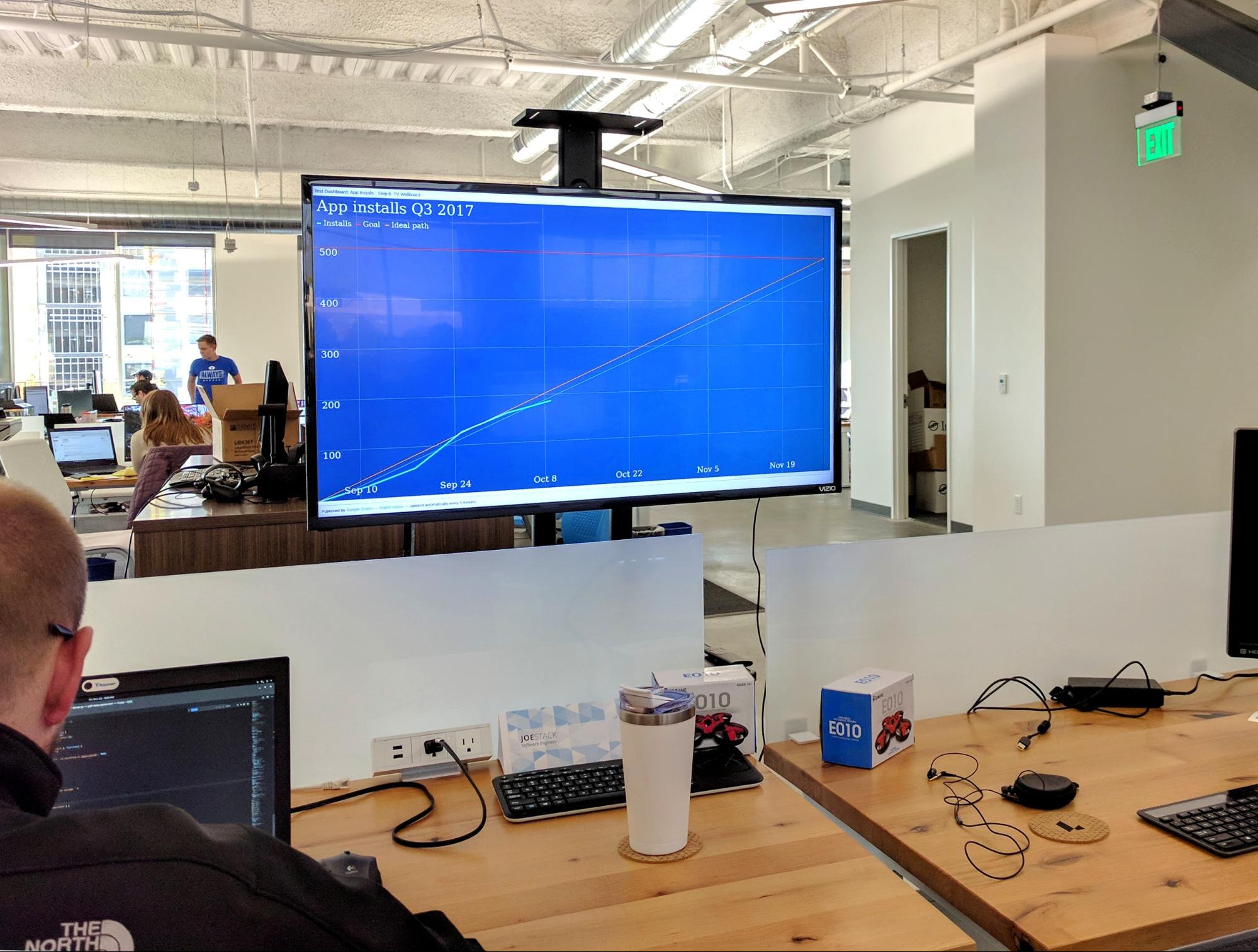
Step 6: Make it TV-friendly
The effect of putting your team’s key metrics on the wall is profound. Your teammates don’t have to remember to check the key performance indicators by digging up the right spreadsheets or emails. Having this information in front of them inspires more frequent data-centric conversations and cultivates a more data-driven approach within the organization.Time to make our data dashboard ready for the big screen! Put the chart on its own sheet and resize it to roughly match the resolution of the TV you’re going to use (it’ll take some experimenting). To remove the odd white padding around the chart, check Maximize in Chart style.Formatting the chart for TVThere are a few more final touches worth adding, but I won’t describe them in detail:
Increase the font size of titles and labels.
Remove labels that are unnecessary (e.g. axis titles).
Increase line thickness for improved readability.
Change colors for better contrast.
Tweak the grid lines.
The final result looks much more readable: you can now read everything on the data dashboard without squinting. Bonus points for impressing your colleagues by applying your brand’s colors!Final TV dashboard
Final step: Publish
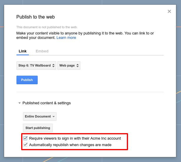
Google Sheets has a handy feature to publish your document as a web page, easily accessible via a link, with all the editor UI hidden. Go to File > Publish to the web and select the sheet with the chart.Make sure to check the option that requires viewers to sign in with your company’s account (requires a G Suite subscription) to ensure that the data isn’t accessible externally.All that’s left is to put the data dashboard on that big flat-screen TV to make the performance data readily available. Here’s how the chart looks on my team’s dashboard TV:Can you tell that the dashboard was made with Google Sheets?The example in this article may seem very specific, but you can apply the same principles to track virtually any metric. In the next post, we will share some ways to automate updating the data dashboards.You can copy the spreadsheet from the article here.What do you use to make data dashboards, and how is it working for you? Share your thoughts in the comments!
About Lucid
Lucid Software is the leader in visual collaboration and work acceleration, helping teams see and build the future by turning ideas into reality. Its products include the Lucid Visual Collaboration Suite (Lucidchart and Lucidspark) and airfocus. The Lucid Visual Collaboration Suite, combined with powerful accelerators for cloud and process transformation, empowers organizations to streamline work, foster alignment, and drive business transformation at scale. airfocus, an AI-powered product management and roadmapping platform, extends these capabilities by helping teams prioritize work, define product strategy, and align execution with business goals. The most used work acceleration platform by the Fortune 500, Lucid's solutions are trusted by more than 100 million users across enterprises worldwide, including Google, GE, and NBC Universal. Lucid partners with leaders such as Google, Atlassian, and Microsoft, and has received numerous awards for its products, growth, and workplace culture.