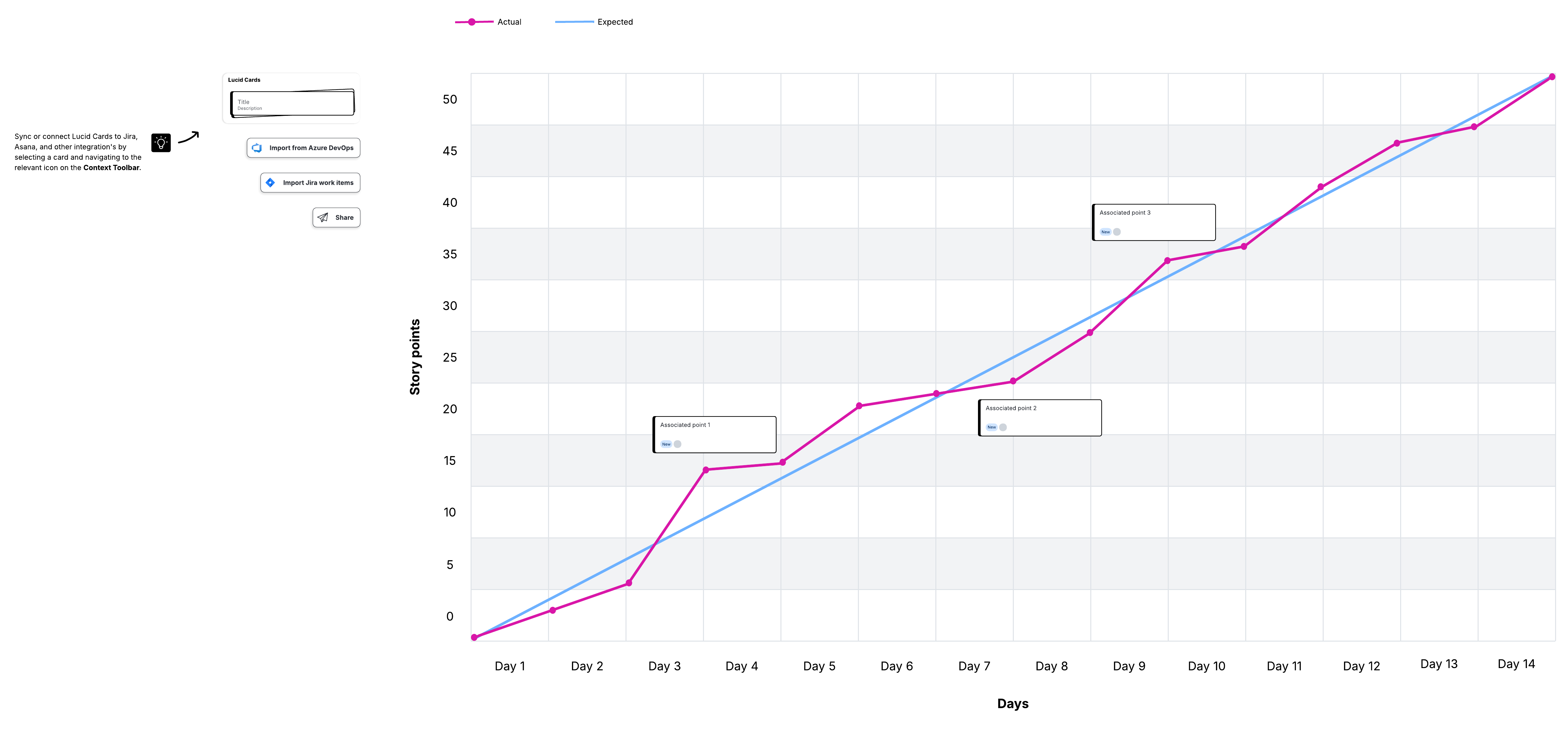
As the team makes progress, the completed work line reflects how much work is finished at each milestone. The total work line stands in for the project scope.
Using a burnup vs burndown chart
On paper, burnup and burndown charts may seem identical. Although they are similar, the crucial difference is how the timeline is defined, lending them to different use cases.
Burnup charts start at zero, while burndown charts move towards zero. For this reason, burndown charts essentially presume a deadline. Burnup charts don’t emphasize the deadline, but focus on what has been accomplished so far.
You can use the difference to your advantage, choosing a burn chart based on the type of project you’re working on, the stakeholders involved, and your planning preferences.
Burnup chart use cases
Burnup charts feature an open-ended timeline by default, since they track elapsed time instead of counting down to zero. As such, you can use a burnup chart to track your projects that are more flexible, have a lot of dependencies, or are relatively complex—situations where the timeline and scope are likely to be subject to change during the course of the project.
Using a burnup chart, you can plan your project by:
-
Breaking down sprints by work completed. You can specifically quantify the amount of work your team finishes during each time period.
-
Comparing finished work against scope. To see where the project is currently compared to the scope’s estimate, all you have to do is compare the work line and the completed line.
-
Motivating your team with overall progress. A burnup chart shows increasing progress on the way to reaching the scope, which is a great way to show your team how productive they’ve been.
Burndown chart use cases
If you are working with a finite, highly specific timeline, a burndown chart can help you identify and troubleshoot problems early. Any disruption impacting the timeline, whether it places you ahead or behind schedule, will show up as a difference between the lines.
With a burndown chart, since you’re counting down both time and work, scope changes may be interpreted as weak productivity. A project with a lot of uncertainty, possible adjustments, or external influences may be a bad fit for a burndown chart.
With a burndown chart, you can:
-
Create team accountability. Scrum burndown charts help teams focus on what work is left versus the remaining time, encouraging accountability for tasks.
-
Define on-time completion. Ideal and actual work lines remove ambiguity during phases of the project where the schedule and timelines are otherwise obscured or confusing.
-
Adjust estimation and planning. Through experience and experimenting with an Agile burndown chart, you can improve your internal processes for task estimation and planning future projects.
Elements of a burndown chart
Burndown charts are meant to be easy to read, so building them consistently is important. Here’s what your burndown chart should include to give your team the information they need.
Timeline on the x-axis
The x-axis is a horizontal line that represents the timeline for the current iteration. Time can be measured in days, weeks, or sprints. During the iteration, the x-axis shows you at a glance how much time remains to complete the work that still needs to be done.
Work remaining on the y-axis
The y-axis is a vertical line that meets at a right angle with the x-axis. This line represents the amount of work remaining to be done.
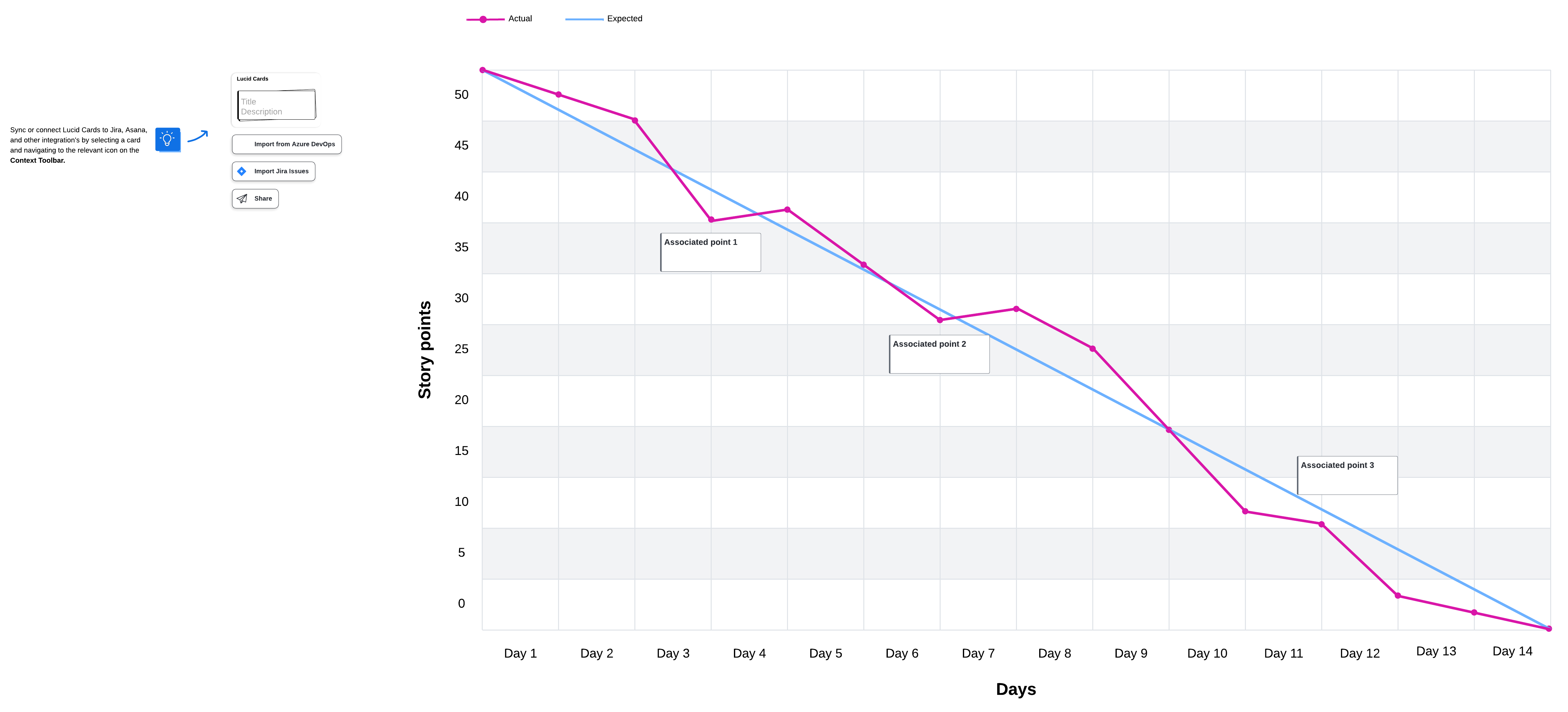
Starting point
The starting point is the farthest point to the left of the chart, at the start of the timeline. The point is placed at the highest part of the y-axis, where all the work still remains, and represents day zero of the iteration.
Ending point
The ending point is the farthest point to the right of the chart. The point is placed at the lowest part of the y-axis, representing the final day of the iteration when all work is complete.
Ideal work line
The ideal work line connects the starting point to the ending point and represents the sum of the estimated work that remains to be completed. This line is called the “ideal line” because if all work is completed exactly as estimated, it will be plotted as a perfectly straight diagonal line.
Actual work line
Work will rarely be completed following the estimated time. Some tasks might be completed before the estimate, while others will be completed after. Tasks completed before the estimate are plotted below the ideal work line, while tasks completed after the estimate are plotted above. The result is a line that fluctuates above and below the ideal line but still trends downward as tasks are completed.
How to create a burndown chart
You can create burndown charts manually on paper and physical whiteboards or on a digital canvas. To create a digital burndown chart, you can use a burndown chart template for a quick start. All you have to do is fill in the specific information for your project.
Whatever kind of burndown chart you want to create, here are the steps to follow:
Step 1: Estimate work
On the y-axis, estimate the work that remains to be completed. This work can be measured in story points or specific tasks. Collaborate with the team to get an idea of what work can reasonably be accomplished in the allotted time frame.
Place the total sum of the work to be done next to the start point on the y-axis. For example, if the team thinks they can complete 50 story points, you would put the number 50 next to the starting point.
Step 2: Estimate remaining time
The team estimates how much time it will take to complete each task. Time can be measured in days, hours, weeks, sprints, or whatever units of time you want to use. Plot the time units on the x-axis to represent the time remaining in the current iteration.
Step 3: Estimate the ideal work line
This line is what the burndown chart would look like if all of the estimated work is completed on time. Draw a straight diagonal line from the starting point to the ending point. This line represents the ideal “burndown” slope if work is completed on time.
Step 4: Track daily progress
If you are used to working in an Agile environment, you probably have daily standup meetings where the team shares progress and the burndown chart is updated. These updates reflect when the work is actually completed in relation to the estimates on the ideal work line.
If work is completed at the estimated time, it is marked on the ideal line. Realistically, some work will be marked below the ideal work line (indicating that the team is ahead of schedule), and other work will be marked above the line (indicating that the team is behind schedule).
No matter what your sprint burndown chart ends up looking like, the important thing to remember is that team members should be able to look at it and instantly understand their progress and what still needs to be done to reach a goal.
Advantages and disadvantages of using a burndown chart in Agile
While Scrum burndown charts help people visualize progress and track their work, charts aren’t always beneficial for every team and may be missing some important information. Here are some key aspects to help you understand the advantages and disadvantages of Agile burndown charts.
Some advantages of using a burndown chart in Scrum include:
-
Creating a visual, transparent point of reference. People often grasp and retain information better when it is presented visually. By displaying the chart where everybody can see it, team members are also encouraged to constantly provide estimates and evaluate their performance.
-
Reducing risk. Since a burndown chart gives the team daily feedback about actual work versus estimated work, the team can respond to issues quickly and make adjustments before they become deeper problems.
-
Saving time. Tracking progress visually is faster and easier than looking through email or other documentation to figure out the current status of a project. And, if you’ve linked your burndown chart to real-time data, it’s simple to keep your chart updated with the most recent information.
Some disadvantages of using a burndown chart in Scrum include:
-
It doesn’t always tell the whole story. A burndown chart can be somewhat limiting because it’s difficult to determine the reason behind changes to the chart. It’s also hard to understand why an actual effort line is below the ideal effort line without extra context.
-
Teams tend to overestimate or underestimate work. It’s challenging to accurately estimate how long a task will take to complete, and sometimes, when the team appears to be behind schedule, it’s simply a matter of underestimation.
-
The chart doesn’t reflect how close work is to being completed. A burndown chart shows you current progress and remaining work, but it does not show you how close the team is to completing the work.
Visualize your work and track progress with Lucid
Sprint burndown charts provide Scrum teams with the information they need to be organized, self-managed, and motivated to reach a common goal. With Lucid, you can easily create these visuals and other useful Agile tools, such as Kanban boards and Scrum boards, to enhance transparency and alignment as your team aims to deliver value. Check out Lucid’s Agile development templates and get started on boosting your team’s agility today.