
Data linking allows users to add live data stored in spreadsheets to their shapes and diagrams. When changes are made to the source data, they are automatically reflected in Lucidchart so that diagrams are always up to date. With data linking, you can spend less time maintaining documentation and more time innovating with your team.
Here’s a closer look at how it works.
Getting started with Lucidchart data linking
Note: This feature requires a Lucidchart Enterprise account. Learn more about Enterprise.
Once you are in the Lucidchart workspace, follow these steps:
- Click File > Import Data, or access data linking from the left-side Formatting bar and click “Import Data.”
- Follow the prompts to select a data source for import.
- Select the file you’d like to import from that source.
Congratulations! You’ve just added data in Lucidchart.

Need more in-depth instructions for using Lucidchart data linking? Check out our help center article.
Go nowAs you spend time building out a full data-linked diagram, here are a few things to note:
- You can add data to an existing shape. Just drag a line or cell of data onto the shape, then add data as text using the “+T” icon that appears when you hover over a cell in the “Selected Shape Data” menu.
- Because CSV files are static documents, only changes made to Google Sheets will automatically appear in Lucidchart after import. To refresh information from a CSV, re-upload the file.
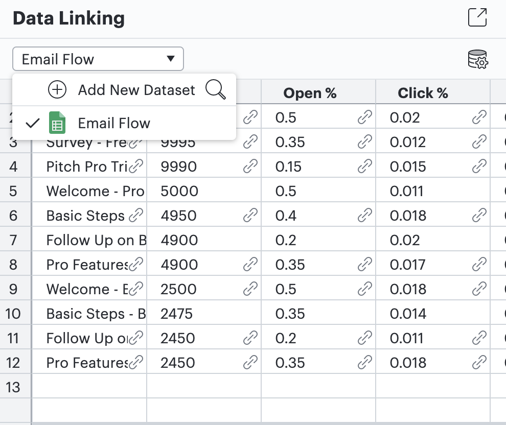
- To link more than one data set, click on the drop-down menu above the imported sheet in the Data Panel, and select “Add New Dataset.” You can also use this panel to toggle between, refresh, replace, or delete linked data sets.
- If your source data is color coded, you can choose to apply your color scheme to the diagram you create in Lucidchart. To do so, hover over a data cell in the “Selected Shape Data” menu. Select the menu icon (represented by three dots), and then select “Apply Imported Fill Color.”
- When you update any data or color schemes on a Google Sheet that have been linked to a diagram, your changes will automatically appear every 30 seconds in Lucidchart. This includes any changes that are triggered by conditional formatting in Google Sheets. You can also manually refresh your data from the Data Panel.
Give data linking a whirl! Open Lucidchart and follow along as you read through these tips and tricks again, or try this interactive training course.
Are you creating a flowchart diagram? Learn how to create a flowchart in Google Sheets.

Get started visualizing your data with an interactive training course.
Start now