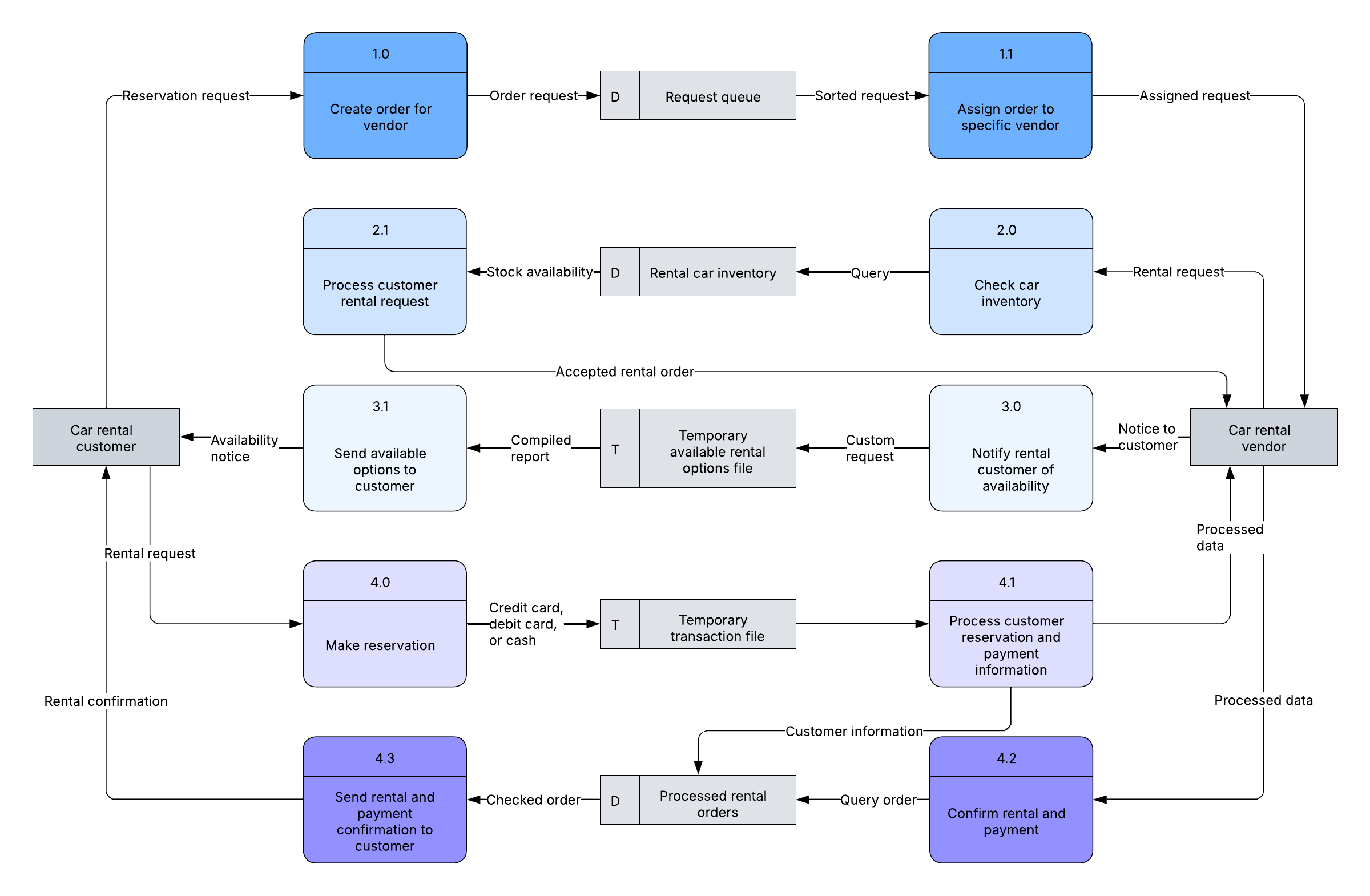
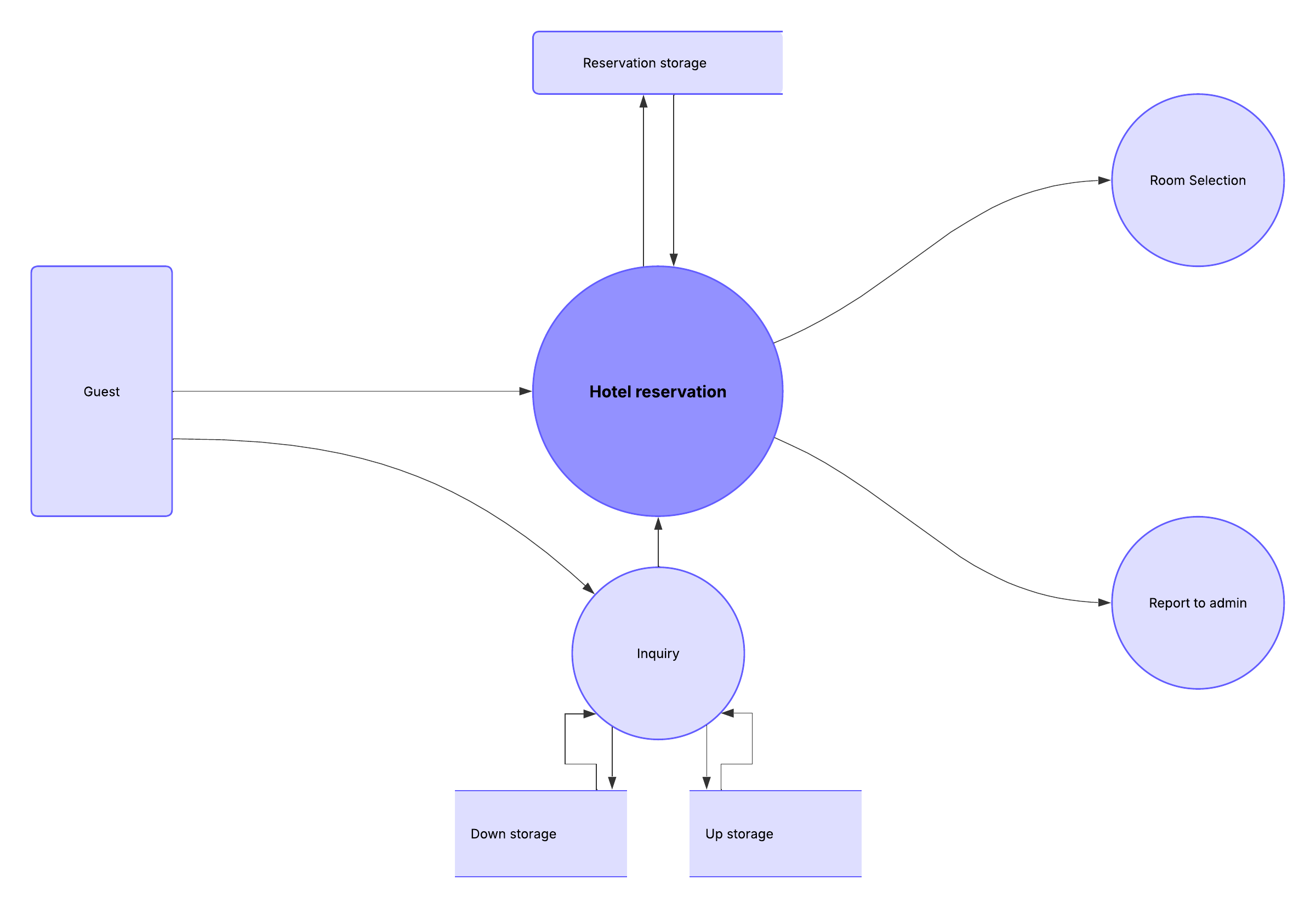
Businesses use data flow diagrams every day to analyze existing systems to see where roadblocks exist and to create new business processes. A data flow diagram (DFD) illustrates the flow and transformation of data for a particular business process. It’s a visual representation of how data flows through a system, so you can clearly see where the data comes from, where it goes, and how it gets stored. Learn how you can make a DFD with Lucidchart in just 10 steps.
Physical and logical data flow diagrams
Before actually creating your data flow diagram, you’ll need to determine whether a physical or logical DFD best suits your needs. If you’re new to data flow diagrams, don’t worry—the distinction between the two is pretty straightforward:
- Logical data flow diagrams focus on what happens in a particular information flow, including what information is being transmitted, what entities are receiving that info, and what general processes occur. The processes described in a logical DFD are business activities. A logical DFD doesn’t delve into the technical aspects of a process or system, such as how the process is constructed and implemented, so you don’t need to include details related to configuration or data storage technology. Non-technical employees should be able to understand these diagrams, making logical DFDs an excellent tool for communicating with project stakeholders.
- Physical data flow diagrams focus on how things happen in an information flow. These diagrams specify the software, hardware, files, and people involved in an information flow. A detailed physical data flow diagram can facilitate the development of the code needed to implement a data system.
Both physical and logical data flow diagrams can describe the same information flow. When used together, they provide more detail than either diagram would independently. As you decide which to use, keep in mind that you may need both.
Check out this guide to physical and logical DFDs for more information.
Data flow diagram symbols and notation
There are four basic elements of a data flow diagram: processes, data stores, external entities, and data flows. Depending on the methodology (Gane-Sarson vs. Yourdon and Coad), DFD symbols vary slightly. For example, Yourdon and Coad notation uses circles to represent processes, whereas Gane-Sarson notation uses rectangles with rounded corners. Another variation is the symbol used for data stores—Yourdon and Coad notation uses parallel lines, while Gane-Sarson notation uses an open-ended rectangle.
If you’re unsure how to use each symbol, read our DFD symbols guide.
Elements of a data flow diagram
To get started, you’ll need to create a context diagram (also called level 0), which represents the entire system. Think of this as the bird’s eye view that just about anyone—engineers, clients, and executives—can look at to understand how a process works. Once you’ve created a DFD, you can add levels that include more information about a process. You can continue to add additional layers to the DFD, but you’ll want to keep these to a minimum. To learn more about data flow diagrams, check out our guide.
Standard data flow diagram symbols represent different parts of the system. For example, you’ll use one shape to represent an external entity and another symbol for a process. Here are the symbols you’ll need to use to create a DFD:
- Processes are represented by a circle or square with a horizontal line across the top. A process is a business activity where the manipulation and transformation of data occurs. Something happens to the data during a process.
- Data stores are rectangles (sometimes they have a vertical line in the symbol), and they show where required or produced data related to the process is stored.
- External entities are shown as a square. An external entity can be a person, system, or application. It’s where data starts or ends.
- Data flows are represented by arrows. The type of data moving through the system is used as the name for the arrow.
10 simple steps to draw a data flow diagram online with Lucidchart
Now that you know what makes up a data flow diagram, let’s see how easy it is to make one using our powerful, online solution. We provide a variety of templates to use as a starting point. In this how-to, we’ll show you how to create a level 0 DFD for an online shopping experience. Log in to your account (if you don’t have one, sign up to try Lucidchart free) and follow the steps below to make a DFD.
1. Start a new Lucidchart document
From the Lucid Home Page, click + New, select Lucidchart, and select Blank document.
2. Name the data flow diagram
Click on the “Blank diagram” header in the top left corner of the screen. Type the name of your diagram in the text box. The name of your DFD appears in the top left corner of the screen.
3. Add an external entity that starts the process
In the Primary Toolbar, under “Shapes,” you’ll notice a data flow shape library that includes the symbols you’ll need to make a DFD: process, data stores, data flow, and external entities. We have symbols for Yourdon and Coad, Yourdon and DeMarco, and Gane and Sarson methods. You can also add images to the diagram.
Click and hold one of the External Entity symbol and drag it onto the workspace.
Click the highlighted text in the box and type the name of the external entity. For our example, we’re typing “customer.” You can use the curved arrow in the top left corner of the square to rotate the symbol. Delete a symbol by clicking it and pressing delete on your keyboard.
4. Add a Process to the DFD
Drag a process symbol to where you want it on the workspace. Type the name of the process. We’re calling this process “add product to cart.”
5. Add a data store to the diagram
Click and hold on a data store symbol and drag it to where you want it on the workspace. Type the data store name. We’re naming ours “shopping cart.”
6. Continue to add items to the DFD
Drag-and-drop the appropriate symbols to add all the external entities, processes, and data stores to your diagram. Move symbols around by clicking and holding on them, and then drag them to a new location. Click on a symbol to resize it, then click and hold the blue box in one of the corners and drag the corner to make the shape bigger or smaller. Use the background graph as a guide for alignment and sizing.
7. Add data flow to the DFD
Click on an entity, process, or data store, and then click and hold one of the arrow circles and drag the line to the appropriate symbol.
Tip: If you prefer to create the data flow process as you complete the diagram, click on an entity, process, or data store and then click and hold one of the circles and drag the line to draw an arrow. Release the mouse button and a box with DFD symbols will appear. Click on the shape you want to add and it will automatically be created.
8. Name the data flow
Add a name to describe the data flow by double-clicking on the arrow line. An option to type text will appear; type the data flow name.
9. Customize the DFD with colors and fonts
Once you have the basic design of your diagram, you can add colors to symbols, change fonts, and adjust arrows. Here’s how:
- Add colors to symbols: Click on a symbol on the diagram and then click the color-fill icon in the context menu at the top of your canvas to choose a color. To make multiple symbols the same color, click the first item and then hold the shift key and click the remaining shapes. Next, click the color-fill icon and choose a color.
- Change the font: Choose Select All from the Select option in the menu. Click the font box, choose a new font, and click it. All text in the diagram will be updated. You can use the other shortcuts (font color, size, bold, italic, underline, and alignment) to customize the font even more.
- Adjust arrow style: Click an arrow to select it. Next, click the arrow icon in the menu bar and choose one of the nine other styles. To change the style of all the arrows, choose Select All from the Select menu.
10. Add a title to your diagram and share
In the Shapes menu, you’ll see a capital T in the Standard shape library. Click it and drag it to where you want to add a title to the diagram. Type the title, and if you’d like to, adjust the font and type size using the shortcut keys at the top of the screen.
You can easily share your DFD with others via email or link or embed it on a website. Click the Share button in the top-right corner of the screen and a pop-up will appear. Choose how you’d like to share the DFD and enter the appropriate information.
When you add a collaborator by sending a link to the DFD via email, you can work on the data flow diagram simultaneously and use the chat feature (the yellow quote icon in the top right corner of the screen) to have discussions.
The easiest way to make a data flow diagram online
Beyond following these steps, you can also make a data flow diagram in Lucidchart using Lucid AI to generate a diagram from a voice or text prompt or start with a ready-to-use template. Since Lucidchart is a web-based app, your diagram is automatically saved, and you can access it virtually anywhere you have an internet connection. Sign up for a free trial and see how easy it is to use Lucidchart.
Start a free Lucidchart account to build data flow diagrams and visualize your systems.
Sign up